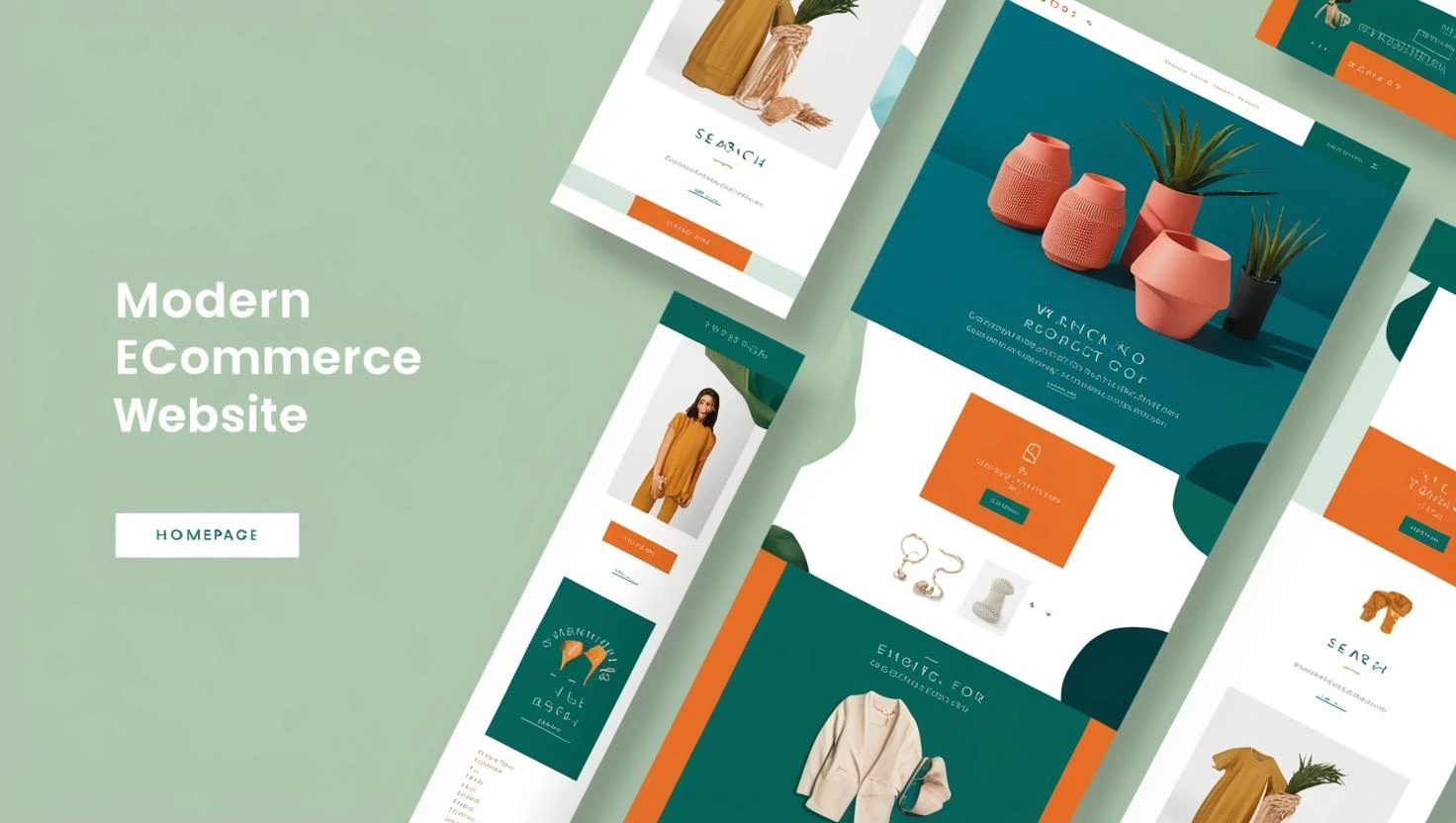
Introduction
Is your online store quietly losing customers? These warning signs say it’s time for a serious refresh.
In the fast-paced world of eCommerce, change is the only constant. With customer expectations evolving rapidly—especially in digitally savvy markets like Singapore—your online store must do more than just exist. It needs to perform. And when performance starts slipping, the culprit is often a neglected, outdated, or poorly optimised website.
Whether you’re an SME owner in Singapore, a freelancer managing WooCommerce stores, or a brand scaling up your digital presence, recognising the early signs that your eCommerce store needs a redesign is crucial to stay competitive.
Here are five major red flags that your online store may be silently signalling. If any of these sound familiar, it’s time to seriously consider a redesign.
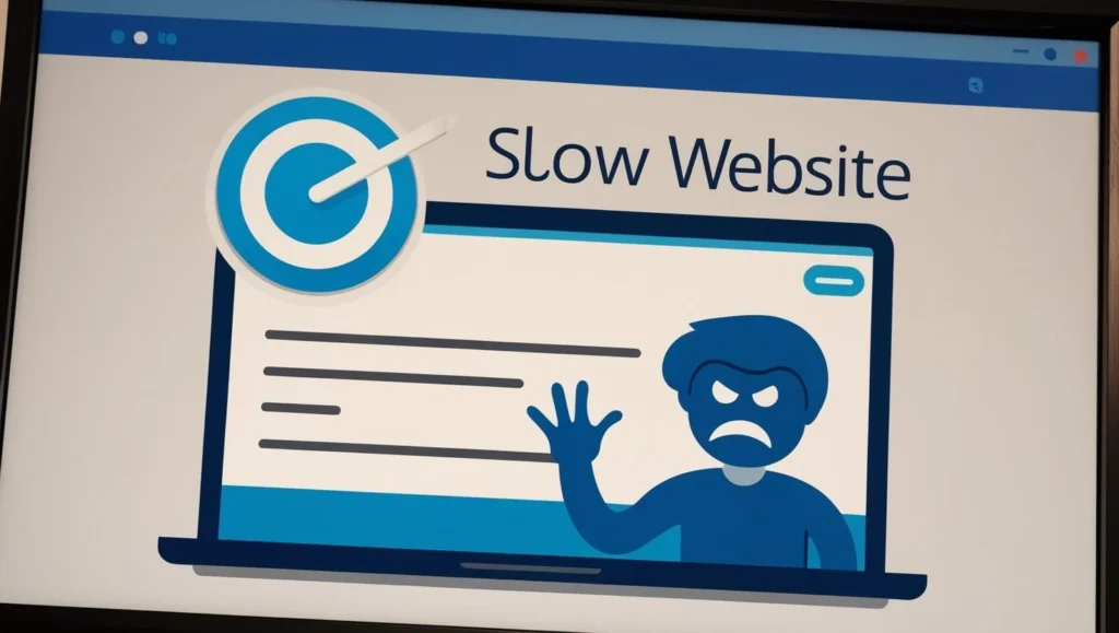
Red Flag 1: Your Website Loads Slower Than Singapore MRT Peak-Hour Traffic
Why Does It Matter?
Speed isn’t just a luxury in eCommerce – it’s a conversion driver. Studies show that 53% of mobile users abandon a site that takes longer than 3 seconds to load. In a country like Singapore, where mobile internet penetration is near-universal and high-speed broadband is the norm, slow sites stand out for all the wrong reasons.
When your pages take too long to load, customers get frustrated. And frustrated customers rarely make purchases.
Local Insight:
Singaporean shoppers are among the most impatient in Southeast Asia when it comes to online browsing. They’re used to seamless experiences from platforms like Lazada, Qoo10, and Shopee. If your site lags even slightly, your potential buyer is just one tab away from your competitor.
Symptoms of a Slow Site:
- High bounce rate from product pages
- Delays in checkout loading
- Image-heavy pages without optimisation
- Outdated hosting or bloated themes/plugins
Fix It:
- Use tools like Google PageSpeed Insights or GTmetrix.
- Migrate to a faster hosting solution (ideally a Singapore-based server for local speed).
- Consider lightweight, performance-focused themes like Astra or Blocksy.
- Optimise images and defer non-essential scripts.
Red Flag 2: Your Mobile Experience Is a Nightmare
Why Does It Matter?
As of 2025, more than 80% of eCommerce traffic in Singapore originates from mobile devices—a statistic that continues to grow year on year. This shift towards mobile-first browsing and purchasing isn’t a passing trend; it’s the new norm, particularly in a tech-savvy society where smartphones are the primary gateway to digital experiences. Consumers in Singapore increasingly rely on their mobile devices not just for casual browsing, but for comparing products, reading reviews, and making purchases—all on the go.
Given this reality, a desktop-first web design is not just outdated—it’s actively limiting your revenue potential. A website that isn’t fully responsive or fails to offer an intuitive mobile shopping journey puts your business at a significant disadvantage. Slow loading speeds, improperly scaled images, tiny tap targets, horizontal scrolling, and difficult navigation on mobile devices are all common culprits that frustrate users and drive them away before they even reach the checkout page.
For Singapore’s fast-moving, mobile-driven audience, particularly younger consumers and busy professionals, convenience is everything. They expect lightning-fast load times, clean layouts, thumb-friendly navigation, and seamless payment options like PayNow, Apple Pay, or GrabPay—all optimised for small screens. If your store doesn’t deliver that level of usability, users will quickly bounce to a competitor who does.
Moreover, search engines like Google now prioritise mobile-first indexing, which means your site’s mobile performance directly affects your search rankings. In other words, an unoptimised mobile site doesn’t just frustrate users—it also makes it harder for them to find you in the first place.
In a highly competitive eCommerce environment like Singapore’s, where large platforms and agile startups are constantly raising the bar for mobile UX, failing to optimise for mobile is equivalent to shutting the door on a massive portion of your audience. If your current design still revolves around desktop-first principles, it’s a glaring red flag that a comprehensive redesign is urgently needed—one that puts mobile usability at the core of your strategy and meets the evolving expectations of today’s digital shopper.
Local Insight:
Singaporeans shop during their commutes, lunch breaks, and even while queueing at hawker centres. If your mobile UI isn’t thumb-friendly, customers will bounce faster than a ball at East Coast Park.
Signs You Need a Mobile Redesign:
- Buttons are too small to tap
- Text or images spill off the screen
- The checkout process is fiddly or cluttered
- Mobile load speed is significantly slower than desktop
Fix It:
- Use progressive web app (PWA) technology to make your site feel like a native app.
- Switch to a mobile-first theme or framework.
- Simplify navigation and enable sticky headers for quicker access.
- Test your site across a range of devices using BrowserStack or real-device testing.
Red Flag 3: Your Design Feels Like It’s From 2015 ( Because It is)
Why Does It Matter?
Design trends don’t just change with time—they evolve alongside user expectations, technological advancements, and shifts in digital culture. What looked modern and cutting-edge just a few years ago might now come across as outdated or uninspired. In today’s fast-paced digital landscape, especially in visually driven markets like Singapore, the aesthetic appeal of your website plays a massive role in shaping first impressions—and those first impressions can make or break a sale.
A dated website can unintentionally communicate the wrong message. To many users, it signals that your business may be out of touch, behind on innovation, or even neglectful of customer experience. This creates an immediate trust issue—regardless of how good your products or services might be. Shoppers in Singapore, who are often exposed to slick, high-performing regional and global eCommerce platforms, will unconsciously compare your site’s design and usability to what they’ve experienced elsewhere. If your store feels visually stale or lacks modern UX features such as interactive elements, responsive layouts, or dynamic visuals, users are more likely to question your credibility.
Moreover, design isn’t just about looking good—it’s about conveying professionalism, authority, and care. An attractive, up-to-date design communicates that you value your customers’ experience and are committed to maintaining a high standard. On the flip side, a “meh” design—one that feels generic, cluttered, or just plain outdated—can drag down your brand image and drastically reduce your conversion potential. Even the best product in the world can get overlooked if the digital packaging doesn’t do it justice.
If your store hasn’t had a design refresh in several years, or if it still resembles a template from the early 2010s, it’s likely doing more harm than good. In such a competitive market, where user expectations are constantly rising, keeping your design modern, polished, and engaging isn’t just a nice-to-have—it’s essential for staying relevant and converting visitors into loyal customers.
Local Insight:
Singaporeans are highly design-conscious consumers, shaped by years of exposure to sleek, polished digital experiences across platforms like Shopee, Lazada, Zalora, and global players such as Amazon and ASOS. In this fast-paced, hyper-connected market, users form snap judgments about a brand’s professionalism and trustworthiness based almost entirely on its digital storefront. It takes just a few seconds for visitors to decide whether to stay and browse—or click away to a competitor.
This is especially true among Millennial and Gen Z shoppers, who make up a growing portion of Singapore’s digital economy. These digital natives have been raised in an era of minimalism, mobile-first interfaces, and pixel-perfect design. For them, a clunky website isn’t just inconvenient—it’s off-putting. If your eCommerce site looks outdated, overly busy, or simply lacks a polished, cohesive aesthetic, it immediately sends the message that your brand might not be trustworthy, modern, or user-focused. These consumers are more likely to abandon their carts or leave your site altogether in favour of competitors with sharper, more intuitive designs—even if your products are better or priced more competitively.
And the competition is fierce. Many Singapore-based SMEs now operate on platforms like Shopify, which come with professionally designed themes that are visually appealing right out of the box. If your WooCommerce site doesn’t measure up in terms of design and user experience, you may find it increasingly difficult to keep up—not due to your offerings, but because of how they’re presented.
In a culture where aesthetic credibility directly influences perceived value, every visual element on your website matters. From the spacing of your headlines to the colour contrast of your buttons, design plays a direct role in whether someone continues their journey toward purchase. For Singaporean shoppers, especially the younger, mobile-first demographic, a poorly designed site isn’t just a red flag—it’s a dealbreaker.
To stay competitive and build lasting trust, your eCommerce design must resonate visually with today’s design-savvy audience. If your site falls short, it may be time to consider a redesign that aligns with modern UX standards and the high expectations of Singapore’s digital marketplace.
Visual Redesign Triggers:
- You’re still using sliders, outdated fonts, or clashing colour schemes
- Your branding isn’t reflected in your UI
- Product pages look generic or cluttered
- Inconsistent styling across categories
Fix It:
- Redesign with a focus on branding, whitespace, and visual hierarchy.
- Use high-resolution imagery with consistent styling.
- Consider UX/UI refreshes in Elementor, WPBakery, or a custom-coded solution.
- Hire a UI/UX designer if needed—especially if you’re PSG-funded and aiming for long-term growth.
Red Flag 4: Your Conversions Are Dropping and You Don’t Know Why
Why Does It Matter?
If your website traffic remains steady or even increases, but your sales figures are showing a consistent downward trend, it’s a strong indication that something within your site’s structure is obstructing conversions. Often, the issue isn’t a lack of interest—it’s friction within the user journey that deters customers from completing their purchase. In many cases, this stems from a flawed design or poor user flow.
Elements such as unintuitive navigation, a checkout process that feels overly complex or disorganised, unclear or poorly placed calls-to-action (CTAs), and a general lack of visual trust indicators—like SSL certificates, customer reviews, return policies, or secure payment logos—can all contribute to last-minute cart abandonment. These may seem like minor issues in isolation, but together they create a disjointed experience that subtly erodes user confidence and frustrates the buying process.
This becomes particularly critical in markets like Singapore, where eCommerce users are both digitally savvy and highly discerning. Shoppers expect seamless, secure, and streamlined journeys from homepage to checkout, especially when they’re used to polished platforms like Lazada or Shopee. Any barrier, no matter how small, can tip the balance and send them to a competitor’s site instead. If your design is failing to convert visitors into buyers despite healthy traffic levels, it’s a clear sign your store needs to be reassessed—not just aesthetically, but strategically—with conversion optimisation and customer trust at the forefront.
Local Insight:
Singaporean shoppers are among the most digitally sophisticated in Southeast Asia, and they’re extremely sensitive to any form of friction during their online shopping experience. With a growing reliance on mobile commerce, same-day delivery expectations, and access to global marketplaces, local consumers have come to expect not just fast websites—but intuitive, seamless, and highly trustworthy shopping journeys from start to finish.
Speed and clarity are no longer luxuries—they’re non-negotiables. If your eCommerce store’s checkout process is clunky, lacks visible trust elements, or feels even slightly questionable, you risk losing potential sales in mere seconds. Key trust signals such as an SSL certificate (ensuring secure connections), familiar payment icons (e.g., Visa, MasterCard, PayNow, GrabPay), visible customer reviews, and clear return or refund policies are crucial in building customer confidence. Without these, many shoppers will hesitate to proceed—or worse, abandon their cart entirely.
Similarly, vague or poorly designed calls-to-action (CTAs) can severely undercut conversions. Buttons that say “Click Here” or “Submit” fail to inspire action or communicate value. In contrast, targeted CTAs like “Secure Your Order Now” or “Checkout with Confidence” provide both clarity and reassurance. In a highly competitive digital retail environment like Singapore, where eCommerce giants like Shopee and Qoo10 dominate consumer expectations, even the smallest design misstep can cost your business dearly. If your site doesn’t meet these evolving expectations, it may be time to revisit your design with user psychology and local behaviour in mind.
UX Triggers That Kill Conversions:
- Confusing checkout steps or excessive form fields
- No guest checkout option
- Inadequate product descriptions or missing reviews
- Lack of payment methods preferred in Singapore (PayNow, GrabPay, etc.)
Fix It:
- Add Visual trust signals (SSL badge , reviews, logos, refund policy)
- Run heatmaps and session recordings (e.g.., Hotjar) to spot bottlenecks.
- A/B test new layouts, CTA placements, and checkout flows.
- Redesign the checkout process for simplicity and speed.
Red Flag 5: Your Store Is Hard to Manage or Update
Why Does It Matter?
Even the most visually stunning eCommerce website quickly loses its value if it’s difficult—or downright impossible—to maintain. While aesthetics and front-end design matter, the true power of a website lies in its long-term usability and ease of management. A theme that consistently breaks every time WordPress or WooCommerce releases an update can become a nightmare for any business. Worse still, if your website’s backend is so convoluted that it requires a developer’s intervention just to make minor changes—like adjusting product prices, updating inventory, or modifying banners—you’re looking at an unsustainable system, particularly for SMEs operating with lean in-house teams.
In Singapore, where SMEs often manage digital operations internally without full-time IT staff, this lack of flexibility can be a significant barrier to growth. Every delay in updating your site means missed sales opportunities, outdated promotions running live, or incorrect stock levels being displayed. These small issues can accumulate quickly, hurting customer trust and affecting revenue. A modern eCommerce website should empower your team—not hold them hostage. If your current platform leaves you feeling dependent on external help for basic updates, that’s a strong indication it’s time for a redesign focused on simplicity, usability, and scalability.
Local Insight:
Singaporean SMEs often operate with lean digital teams (or even solo founders). If updating your site means paying a freelancer or developer every time, it’s time for a system that empowers your internal team to manage the site efficiently.
Operational Red Flags:
- You avoid updating plugins because they “break the site”
- Adding a new product feels like a mini project
- No staging environment for testing updates
- Custom-coded features with no documentation
Fix It:
- Redesign your admin backend for ease of use and scalability.
- Migrate to a more user-friendly theme or builder (e.g., Elementor, Kadence).
- Set up staging and backup workflows for safe updates.
- Streamline your tech stack—fewer plugins, more native features.
Conclusion : Redesign Isn’t a Cost – It’s an Investment
An eCommerce redesign is not about jumping on the latest design trends or trying to impress your competitors. It’s about creating an experience that is fast, mobile-friendly, user-centric, and conversion-optimised—especially in a market as competitive and digitally advanced as Singapore.
If your store shows even one or two of these red flags, it’s time to pause and reflect. A site redesign might just be the transformation you need to increase sales, improve customer satisfaction, and future-proof your business in a digital-first era.
What’s Next?
Noticed some of these red flags on your eCommerce site?
Don’t wait for customers to slip away. At DIGIPIXEL, we specialise in helping Singaporean SMEs transform outdated online stores into modern, mobile-optimised, high-converting experiences.
Contact us at DIGIPIXEL today for a free consultation. We’ll help you choose the right WooCommerce theme, streamline your user journey, and even advise on how to make the most of PSG funding for your redesign project. Let’s build a store your customers will love – from first to final checkout.