Summary
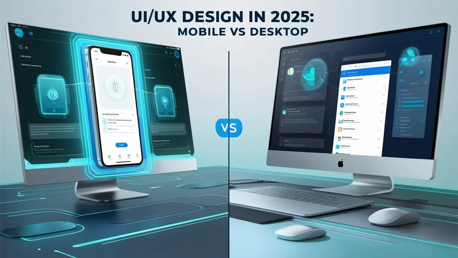
In 2025, users expect smooth and seamless digital experiences across every device, from mobile phones to desktops and wearables. This blog explores the differences between mobile and desktop UI/UX design and explains how responsive layouts, native design patterns, and unified design systems create intuitive and consistent experiences. By understanding mobile simplicity, speed and touch interactions alongside desktop precision and richer content, designers can deliver digital products that are both engaging and reliable.
Exploration of Mobile Vs Desktop UI/UX Design
As we step into the digital-first era of 2025, one truth stands out clearly: users now expect a seamless, intuitive, and engaging interaction with digital interfaces across every device they use.
The shift from a traditional desktop-focused internet experience to one that is increasingly mobile and multi-platform means that mastering the differences between mobile vs desktop UI UX design is no longer optional. It has become a strategic necessity. Today’s users move effortlessly between smartphones, tablets, laptops, desktops, and even wearable technologies. To keep pace, brands must deliver a consistent yet device-specific experience that adapts to every context, screen size, and user expectation.
Neglecting these design nuances risks more than just a clunky interface. It creates a fragmented journey that frustrates users and diminishes trust in a brand’s digital presence. In this hyper-connected world, digital products must not only look good but also function smoothly across every platform.
UI vs UX: The Differences
When we talk about UI UX design, the two terms are often used interchangeably. In reality, they are distinct but complementary disciplines:
| Aspect | UI (User Interface) | UX (User Experience) |
| Definition | The visual and interactive elements that allow users to engage with content. | The overall experience of interacting with a product or system. |
| Focus | Looks, layout, and aesthetics of the product. | Functionality, usability, and emotional satisfaction. |
| Key Elements | Buttons, icons, typography, color schemes, layouts, animations. | Task completion, intuitive navigation, logical flow, user satisfaction. |
| Goal | To create a visually appealing and functional interface. | To make interactions seamless, effortless, and enjoyable. |
| Scope | Limited to what users see and interact with directly. | interact with directly.Encompasses the entire journey from start to finish. |
A beautiful UI without usability quickly frustrates users, while a functional UX with outdated visuals feels uninspiring. The most successful products bring both elements together in harmony, creating an experience that engages, delights, and delivers results.
Mobile vs Desktop: Why Design Deferences Matter
The balance between UI and UX changes significantly depending on the device. Mobile design operates under constraints such as smaller screens and touch-based navigation, which demand clarity, speed, and simplicity. In contrast, desktop design provides more space for complex layouts, richer content, and detailed interactions.
In 2025, it is essential for designers and brands to understand these platform-specific differences. At the same time, they must ensure a smooth and cohesive transition between devices. A user might begin their journey on mobile during a commute and complete it later on a desktop at home. Both experiences must feel consistent, intuitive, and aligned with the same brand promise.
Mobile Website Design in 2025: Why Simplicity, Speed, and Easy Navigation in UI/UX Matter
Mobile devices have become part of everyday life. In 2025, smartphones are no longer just communication tools. They are multi-purpose companions with so many tasks handled on a device that fits in the palm of a hand, the UI/UX design of mobile websites and apps must focus on fast, simple, and intuitive interactions. Simplicity, speed, and usability have never been more important.
Screen Size and Mobile Website Design Layout
One of the most obvious differences in mobile website design compared to desktops is the smaller screen size. UI/UX designers must carefully prioritize what users see. To make the most of the limited space, designers should focus on:
- Essential content first : Display only the most important information up front.
- Minimal clutter: Remove unnecessary elements that distract or slow down the experience.
- Scannable layout: Use short text blocks, clear headings, and enough white space for easy reading.
- Prominent calls-to-action (CTAs):Place key actions like “Buy Now” or “Sign Up” where they are easy to tap.
- Readable typography: Choose fonts and sizes that are clear on small screens.
- Optimized images: Use visuals that load quickly without compromising quality.
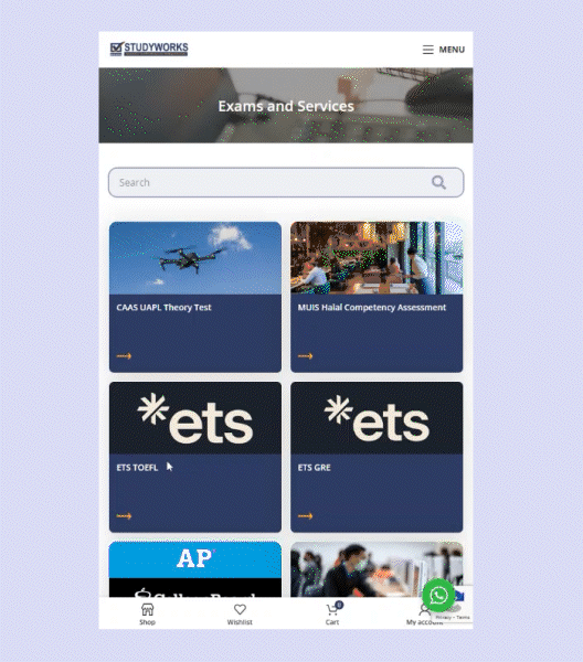
User case example: For our client Studywork, which sells digital products such as TOEFL preparation coupons, users need to quickly understand the product, its description, and the redemption process. By keeping the layout clean, highlighting key information, and placing the “Purchase” button immediately after the main headings, users can complete their transactions effortlessly. Additional details are accessible via dropdowns, reducing clutter while ensuring all necessary information is available at a glance.
Mobile Website Design for Smooth UX with Swipes and Taps
Unlike desktops that rely on a mouse and keyboard, mobile devices depend on touch. Swiping, tapping, pinching, zooming, and dragging are the main ways users interact. This requires a different design approach. Buttons that work well on a desktop may fail on mobile if they are too small, too close together, or don’t provide clear feedback.
For an effective UI/UX design, every tap or swipe must feel effortless. Mobile-friendly buttons should be large enough, well-spaced, and responsive to ensure that touch interactions feel natural and intuitive.

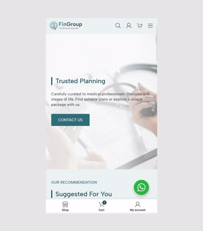
User case example: One of Digipixel’s recent projects with Fingroup involved launching their service as a product on an eCommerce website. On the desktop view, users can complete their purchase on a single screen without being redirected to another page. On mobile, however, swipe functionality on the same page is essential to avoid unnecessary loading of additional pages. As shown in the visual above, once users click the CTA button, the checkout process appears as a swipe on the same page, ensuring a smooth and seamless experience.
UX Tips in 2025:
- Use larger touch targets: Buttons and links should be big enough for easy tapping without mistakes.
- Keep enough spacing: Leave room between buttons and links so users don’t tap the wrong one.
- Provide instant feedback: Buttons should visually respond (change color, highlight, animate) when tapped.
- Avoid hover-based actions: Hover states don’t work on mobile, so replace them with clear tap or swipe actions.
- Design for one-hand use: Place key controls within easy reach of the thumb, usually toward the bottom of the screen.
- Support familiar gestures: Use common gestures like swipe-to-delete or pull-to-refresh instead of inventing complex new ones.
- Prioritize accessibility: Ensure buttons have text labels, proper contrast, and support for screen readers.
Mobile Website Design that Supports Fast Loading
People often use mobile devices in busy or unpredictable environments. They may be commuting, walking, or multitasking with limited attention. Network connections can be weak, and lighting conditions may vary. Good mobile UX should account for these realities.
Websites and apps should load quickly, even on slower connections, and ideally provide offline features where possible. The design should adjust smoothly between portrait and landscape modes, and tasks should be simplified. To make the experience smoother, mobile website design can include helpful features such as:
- Autofill forms: Reduces the time needed to enter repetitive information.
- Single sign-on (SSO): Lets users log in quickly with existing accounts like Google or Facebook.
- Fingerprint or facial login: Provides fast and secure authentication without typing passwords.
- Persistent session states: Keeps users logged in so they don’t have to re-enter details repeatedly.
Mobile Website Design for Performance and Battery Efficiency
Unlike desktops, mobile devices have limitations like battery life and data usage. Apps that drain power or consume too much data quickly frustrate users, especially in regions with expensive or limited data plans.
To overcome this, mobile website design must be optimized for performance. Techniques such as image compression, lazy loading, and background efficiency can improve speed while protecting the user’s device resources. Smooth performance not only makes the experience enjoyable but also builds trust.
Desktop Website Design UI/UX in 2025: Power, Precision, and Expanded Control
Creating an effective desktop website design in 2025 begins with recognising that desktop users typically engage in longer, more focused browsing sessions than mobile users. With greater attention spans, they are able to interact with content in a deeper and more meaningful way.
For this reason, desktop UI/UX design must prioritise clarity and structure, as users are more inclined to complete complex tasks such as filling out detailed forms, carrying out research, or making considered purchase decisions. Unlike mobile users, desktop visitors are also more comfortable managing complex navigation, supported by the advantage of larger screens and the precision of a mouse and keyboard.
Larger Screen Space in Desktop Website Design: Pros and Cons for UI UX
One of the main strengths of desktop browsing is the generous screen space. Larger monitors give designers the opportunity to present more information and create complex layouts without overwhelming the user. This advantage allows for sidebars, dropdown menus, multi-pane layouts, and floating panels that make multitasking and data-heavy work much easier. However, designing for larger screens also comes with challenges that need careful attention.
| Pros of Desktop’s Larger Screen | Cons of Desktop’s Larger Screen |
| Designers can show more detailed information without sacrificing important call-to-action elements, such as buttons and other key visuals. | Too much information on screen can overwhelm users and create confusion. |
| Supports multitasking by letting users manage several tasks at the same time. | Higher cognitive load: With more options visible at once, users may struggle to prioritise actions. |
| desktops make it easier to explore data-heavy corporate websites or detailed e-commerce platforms, such as browsing product catalogues, comparing features, or analysing reports, without feeling cramped. | Navigation spread out: Important elements placed too far apart may slow down interactions compared to compact mobile layouts. |
Desktop Web Design Content Strategy that Impacts User Experience and SEO
Desktops offer the advantage of larger screens, allowing designers to display more relevant content alongside clear navigation. However, the structure of the content is just as important as the amount shown. Research into how people read online reveals that users rarely read every word. In fact, a study comparing five different writing styles found that websites performed 58% better when the content was concise, 47% better when it was easy to scan, and 27% better when written in an objective tone rather than a heavily promotional one.
As a result, web pages should be designed with scannable text in mind. This can be achieved by:
- Using highlighted keywords through links, bold text, or colour variations.
- Writing meaningful sub-headings that clearly guide the reader.
- Breaking up information with bullet points.
- Keeping to one main idea per paragraph, as readers often skim.
- Applying the inverted pyramid style, placing the conclusion or key message first.
- Reducing word count to half (or less) compared to traditional writing.
The next step is understanding how to combine web design content with an SEO approach. As SEO continues to evolve into GEO (Generative Engine Optimisation), it becomes even more important to apply the fundamentals. This means following the principles above while also researching focused keywords and high-traffic queries to ensure your content aligns with what users are searching for.
Mobile Vs Desktop: A Seamless UI UX Approach Across Devices

In 2025, users expect digital experiences that flow effortlessly across devices, from mobile phones and laptops to tablets, desktops and wearables, often within a single session. At Digipixel, we apply responsive design in every web development project, ensuring a consistent experience on all screens.
Creating truly effective websites goes beyond resizing elements. It requires a strategic understanding of business goals, rethinking interaction patterns, workflows and user behaviour to guide users smoothly through tasks such as completing a form or making a purchase.
Delivering this level of seamless and engaging web design combines technical expertise with UX research, including customer journey mapping, which is central to Digipixel’s web design process.
Responsive Design Approach in UI UX on Mobile & Desktop
Responsive web design is an approach that ensures websites adapt seamlessly to all types of devices and screen sizes, whether viewed on a tablet, phone, television, or watch. It follows best practices to create layouts that respond automatically to the device being used.
At Digipixel, we use Elementor Pro, which is inherently responsive, and our website developers enhance it further to ensure interactive features work smoothly on both desktop and mobile views.
Technical Tips for a Responsive Website Between Mobile and Desktop:
- Media Queries: Adjust the layout for different device sizes without altering the content. Useful for tablet landscape, tablet portrait, and other devices.
- Responsive Images: Use
max-widthandmin-heightso images scale correctly on all screens. - Responsive Videos: Apply
aspect-ratioto make videos adapt to any screen size. - Viewport: Add a
<meta>tag to allow browsers to optimise page dimensions and scaling. - Media Queries: Adjust the layout for different device sizes without altering the content. Useful for tablet landscape, tablet portrait, and other devices.
UI/UX Tips:Understanding Native Design Patterns
Native design patterns are the familiar design conventions and behaviours that users expect on a specific platform. They make apps and websites intuitive by following the rules people are already used to.
| Platform | Native Design Patterns | What users expect |
| iOS | Top menu bars, bottom tab bars, swipe gestures | Top menu bars show key actions or page titles. Bottom tabs let users quickly switch between main sections. Swiping makes it easy to move between screens naturally with fingers. |
| Android | Material Design style, floating action buttons, swipe gestures | Material Design provides a clean, consistent look. Floating buttons highlight the most important actions, like adding a new item. Swiping helps users navigate quickly and intuitively. |
| Desktop | Right-click menus, scrollbars, hover effects | Right-click menus give extra options without cluttering the screen. Scrollbars let users move through long content. Hovering shows extra information or previews without clicking. |
UI/UX Tips for Using Native Design Patterns
To create a seamless and intuitive experience, follow the conventions of each platform. Use familiar UI elements, navigation patterns, gestures, and system components to meet user expectations. Maintaining visual consistency with platform-specific fonts, colours, and spacing builds clarity and trust.
Take advantage of built-in accessibility features and responsive design principles to ensure your app works well for all users and across different screen sizes. Use familiar icons (Trashbin for delete, a magnifying glass for search) and terminology to reduce confusion, and keep your app updated with platform changes to maintain a modern, reliable experience.
By thoughtfully integrating native design patterns, you make your app feel natural, easy to use, and aligned with users’ expectations.
Mobile vs Desktop: Unified UI UX Design for Consistency
A unified design system is key to creating a seamless experience across platforms. It defines the visual language, including typography, colours, icons, spacing, and layout, while remaining flexible for each device’s unique needs.
Tools like Figma, Adobe XD, and component libraries such as Bootstrap or Tailwind UI help maintain consistency. They allow designers to reuse components and preserve a unified visual identity across mobile, desktop, and other platforms.
For example, a mobile app may use large, easy-to-tap buttons for touch screens, while the same component on desktop can be adjusted for precise mouse interactions.
Mobile vs Desktop: Why Both Matter in UI UX Design
Mobile and desktop are not competing priorities but complementary experiences that must work seamlessly together. By applying responsive design principles, embracing native patterns, and maintaining a unified design system, businesses can deliver a consistent and user-friendly experience across every device. At Digipixel, we ensure every web design project reflects these principles, creating digital solutions that adapt effortlessly to the way users interact today.