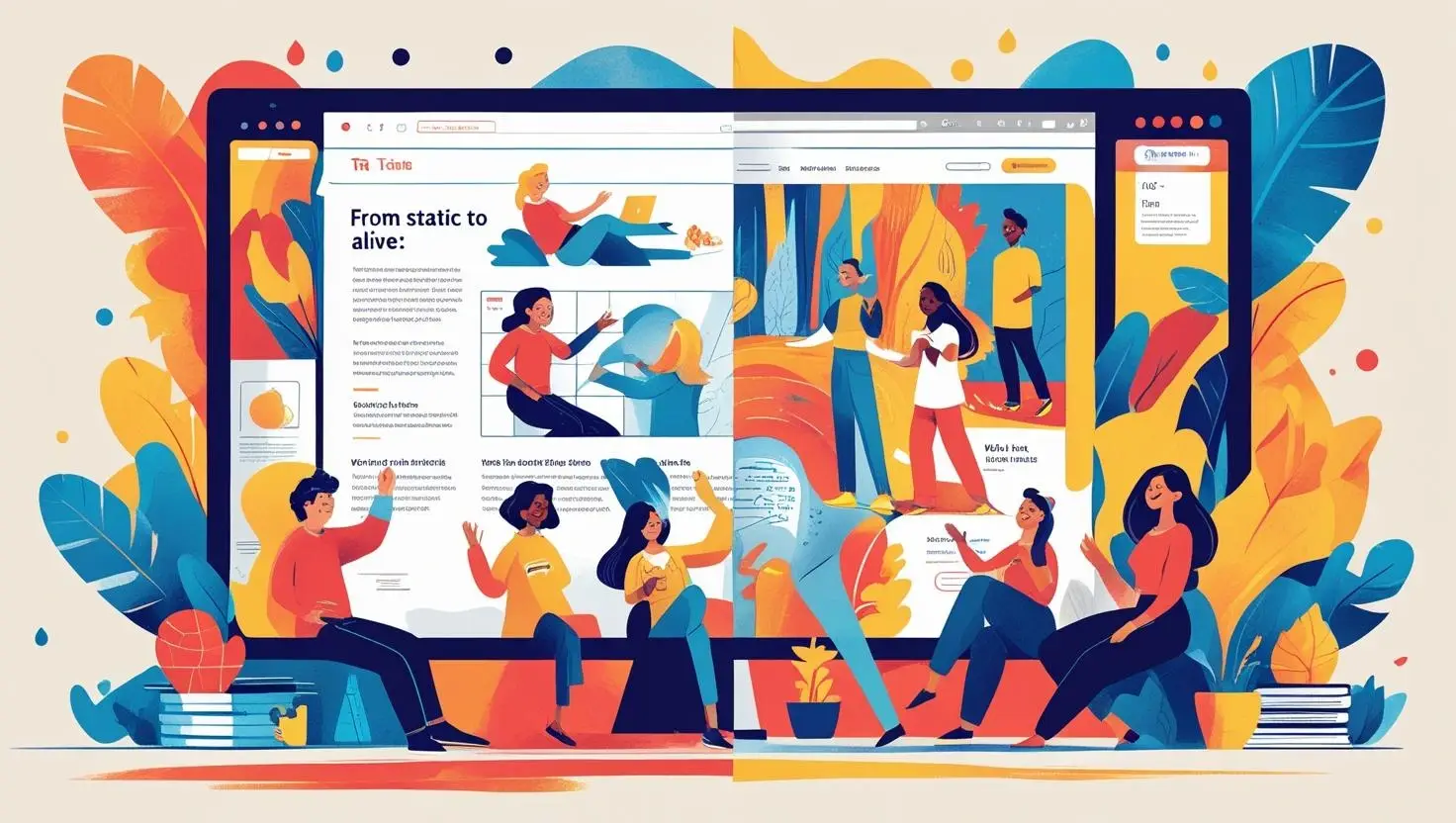
The Problem with Cold, Mechanical Websites
Many websites today feel flat and lifeless. They may be fast, minimal, and clean, but they lack warmth and personality. Users move through them without feeling any connection.
A cold design fails to create trust or engagement. it becomes another forgettable page in the vast digital sea. The site may work perfectly but feel soulless.
People want to interact with brands that feel human. This emotional gap is why “humanised” web design matters more than ever in 2025.
Why Human-Centred Design Matters
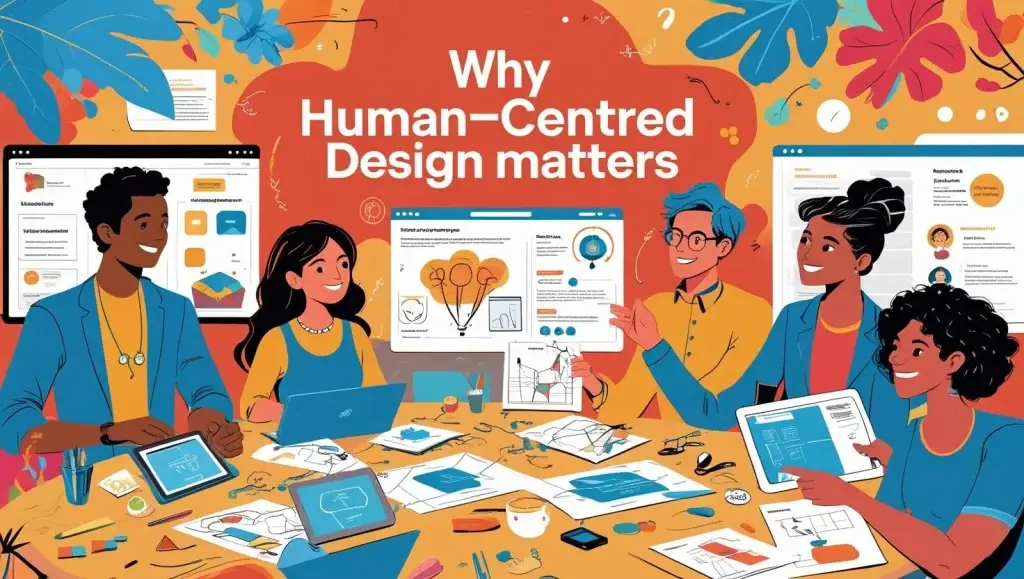
Human-centred design places real people at the heart of every decision. It considers feelings, behaviours, and needs, not just function. This makes digital experiences richer and more meaningful.
When a site feels like it understands you, trust builds naturally. The user relaxes and enjoys the journey. This emotional ease drives longer visits and deeper engagement.
Cold, mechanical sites force users to work. Humanised sites invite users to connect, explore, and stay.
Storytelling as a Human Touchpoint
Stories make digital spaces feel alive. Through text, visuals, or animation, storytelling gives users context and meaning. It turns bland data into memorable experiences.
A website that shares its brand’s journey or mission creates emotional attachment. Users remember the story, not just the service.
Even micro-stories, like onboarding guides or product highlights, make experiences more relatable and human.
Microinteractions Bring Life to Interfaces
Microinteractions are the little details that make a website feel responsive. Button animations, hover effects, and feedback messages show the system is alive and paying attention.
These small moments reduce uncertainty and make the experience smooth. They also surprise and delight, adding charm to simple tasks.
Without microinteractions, a site feels static. With them, it feels alive and engaging.
The Role of Tone and Language
Language shapes personality. Formal, cold text feels distant. Friendly, conversational copy feels warm and human. Every word choice affects emotion.
Microcopy—like button labels or error messages—should feel helpful and kind. It reassures users and reduces friction.
A playful 404 page or a gentle confirmation message turns mistakes into moments of connection. Tone can make technology feel human.
Visual Design That Feels Alive
Static images can make a site feel frozen in time. Motion graphics, subtle animations, or dynamic content bring freshness and vitality.
Parallax scrolling, interactive infographics, and changing backgrounds make pages feel active. They guide the eye and hold attention.
Careful animation adds life without distracting. It gives the site personality and rhythm, like a conversation unfolding naturally.
Personalisation: Speaking Directly to the User
Personalisation makes websites feel like they know the user. Greeting users by name or suggesting content based on past behaviour creates intimacy.
A personalised homepage feels welcoming. It says, “We know you, and this is for you.” That human touch increases loyalty and time spent on the site.
Generic, one-size-fits-all pages feel distant. Personalisation makes every visit feel fresh and relevant.
Breaking the Grid for Natural Flow
Rigid grids create structure, but they can also feel stiff. Asymmetry, irregular shapes, and free-flowing layouts add energy and creativity to design.
Breaking the grid makes the experience feel more organic, like a conversation rather than a lecture. It invites exploration.
Design should feel guided but not forced. A natural, flowing layout mimics real-world interactions and keeps users comfortable.
Empathy in UX Decisions
Empathy turns usability into compassion. When designers imagine the user’s frustrations, joys, and struggles, they create better experiences.
Accessible design is an act of empathy. So is reducing load times, simplifying forms, or explaining errors clearly. These choices make users feel cared for.
Design without empathy feels robotic. Human design feels like someone is on the other side, thinking about your needs.
Humanising E-commerce and Forms
Shopping carts, forms, and checkouts are often lifeless. But small touches can humanise them—like progress bars, supportive hints, or friendly reminders.
A cart that says “Almost yours!” feels warmer than “Checkout.” A form that smiles with a success message feels more inviting.
These moments ease frustration and turn tasks into pleasant parts of the journey.
Conclusion: Websites with a Soul
A humanised website is more than pixels and code. It’s a living space where users feel seen, understood, and valued. This connection builds trust and loyalty.
Sites that ignore the human element feel cold, no matter how polished they are. Those that embrace personality, empathy, and life stand out.
In 2025 and beyond, the most successful web designs will be those that feel alive. They will make technology feel human again.
Design with heart—and your users will remember not just what they did, but how you made them feel.
Contact Digipixel today to build a website that stands out and drives measurable results.