Introduction
Web design is far more than just creating a visually appealing layout; it is the backbone of a seamless user experience and a fundamental aspect of any successful online presence. Whether you are developing a personal blog, an expansive e-commerce platform, a corporate website, or an interactive web application, the importance of a well-structured and thoughtfully designed website cannot be overstated.
With the rapid evolution of digital technology, user expectations continue to shift, making it crucial for designers to stay up to date with the latest trends, advancements, and best practices in web design. The online landscape is more competitive than ever, and a well-crafted design can be the key differentiator between a thriving website and one that fails to capture and retain visitors.
A good web design must balance aesthetics, functionality, performance, and accessibility. It should not only look appealing but also provide an effortless and engaging experience for users across various devices and platforms. Additionally, web design plays a significant role in search engine optimisation (SEO), helping websites achieve better visibility and reach a wider audience.
In this guide, we will delve into the core principles of web design, explore the latest industry trends, and provide insights into how you can create an outstanding website that captivates and converts visitors.
Understanding the Principles of Web Design
Effective web design is built upon several key principles that enhance usability, improve accessibility, and create a visually harmonious digital experience. These principles ensure that websites are not only attractive but also user-friendly, functional, and efficient.
1. User Experience (UX) and User Interface (UI)
A well-designed website should be intuitive, easy to navigate, and tailored to meet the needs of its users. User experience (UX) focuses on making interactions as seamless and efficient as possible, ensuring that visitors can find information quickly and complete their desired actions without unnecessary obstacles. A well-executed UX design eliminates friction in the user journey, keeping visitors engaged and reducing bounce rates.
User interface (UI) design, on the other hand, focuses on the visual and interactive elements of a website. It encompasses aspects such as typography, colour schemes, buttons, menus, and animations that make the interface appealing and user-friendly. A well-structured UI ensures that users can interact effortlessly with the website, enhancing overall engagement.
The synergy between UX and UI is critical to web design success. While UX ensures that the user journey is smooth and logical, UI adds an aesthetic and interactive appeal that makes the experience enjoyable. By striking the right balance between these two elements, designers can create a website that not only looks good but also functions efficiently across different devices and platforms.
2. Responsive Design
With the proliferation of smartphones, tablets, and other smart devices, responsive web design has become a necessity rather than an option. A responsive website automatically adjusts its layout and content to fit different screen sizes, ensuring a consistent and optimal experience across all devices.
A website that is not optimised for mobile devices can frustrate users, leading to higher bounce rates and lower conversions. Studies show that a significant portion of web traffic comes from mobile users, making it imperative for websites to be mobile-friendly.
Key components of responsive web design include:
- Flexible Grid Systems – Using a fluid grid that adjusts dynamically based on screen size.
- Scalable Images and Media – Ensuring that images and videos resize properly without losing quality.
- Media Queries – CSS rules that enable different styles to be applied based on the user’s device.
- Mobile-First Approach – Designing for smaller screens first and then expanding to larger screens.
Designers should conduct thorough testing on various devices to ensure their websites function seamlessly. Tools like Google’s Mobile-Friendly Test can help identify and rectify issues affecting mobile usability.
3. Typography and Readability
Typography plays a pivotal role in web design, influencing how users interact with and absorb content. Good typography enhances readability, ensuring that users can consume information effortlessly without strain.
Several factors contribute to effective typography in web design:
- Font Choice – Selecting fonts that align with the brand identity and maintain legibility across devices.
- Font Size and Line Spacing – Ensuring that text is neither too small nor too large, with appropriate spacing between lines.
- Contrast and Colour – Using high contrast between text and background to enhance visibility.
- Hierarchy and Emphasis – Differentiating headings, subheadings, and body text using size, weight, and colour variations.
Sans-serif fonts such as Arial, Helvetica, and Open Sans are commonly used for digital interfaces due to their clean and modern look. Serif fonts like Times New Roman and Georgia, on the other hand, are often used for more traditional and formal web content. The key is to find a balance between aesthetics and functionality, ensuring that typography complements the overall design without compromising readability.
4. Colour Schemes and Branding
Colours play a fundamental role in shaping a brand’s identity and influencing user perceptions. When strategically used in web design, colours evoke emotions, enhance user engagement, and guide visitors towards specific actions. A well-thought-out colour scheme creates a visually harmonious experience while reinforcing brand recognition.
The Psychology of Colour in Web Design
Colour psychology is an essential aspect of web design, as different colours trigger different emotional responses. Businesses carefully select colours based on the message they want to convey and the feelings they want to evoke in their audience. Here’s how some common colours are perceived in web design:
- Blue – Associated with trust, reliability, and professionalism. It is widely used by corporate websites, financial institutions, and healthcare brands (e.g., Facebook, LinkedIn, PayPal).
- Red – Represents passion, urgency, and excitement. It is often used for call-to-action buttons, sales promotions, and food brands (e.g., YouTube, Coca-Cola, Netflix).
- Green – Symbolises growth, harmony, and sustainability. It is frequently used by eco-friendly brands, wellness companies, and financial firms (e.g., Whole Foods, Starbucks).
- Yellow – Evokes optimism, energy, and creativity. It is commonly seen in brands that want to convey friendliness and enthusiasm (e.g., McDonald’s, Snapchat).
- Black and White – Classic and sophisticated, these colours are often used in minimalist designs, luxury brands, and high-end fashion websites (e.g., Apple, Chanel).
Building a Cohesive Colour Palette
Creating a cohesive and effective colour palette requires careful planning. Designers often use colour theory principles, such as complementary and analogous colour schemes, to achieve visual balance. Here are some best practices:
- Stick to Brand Colours – Your website should align with your brand identity. Using consistent colours across all digital and print materials strengthens brand recognition.
- Use Contrast for Readability – High contrast between text and background improves legibility. For example, dark text on a light background enhances readability, while low contrast can cause strain.
- Limit Your Colour Choices – Too many colours can make a website look cluttered and overwhelming. A well-designed website typically follows the 60-30-10 rule:
- 60% – Dominant brand colour (background or main elements).
- 30% – Secondary colour (menus, buttons, highlights).
- 10% – Accent colour (CTAs, small decorative elements).
- Test Colours on Different Devices Colours may appear differently on various screens and devices. Testing ensures that the intended colour scheme remains consistent across all platforms.
A well-planned colour strategy enhances user experience, strengthens brand identity, and improves overall aesthetics.
5. Loading Speed Optimisation
Website speed is one of the most crucial factors affecting user experience, engagement, and SEO rankings. A slow-loading website can drive visitors away, leading to decreased conversions and lost revenue. Research indicates that 53% of mobile users abandon a site if it takes longer than three seconds to load.
Why Speed Matters
- Better User Experience – Faster websites provide a seamless browsing experience, reducing frustration and increasing user retention.
- Higher Search Engine Rankings – Google considers page speed as a ranking factor. Faster websites are more likely to appear at the top of search results.
- Increased Conversion Rates – Studies show that even a one-second delay in page load time can reduce conversions by 7%.
Techniques to Improve Website Speed
To optimise a website’s loading speed, developers and designers should implement the following strategies:
- Image Optimisation – Large image files slow down a website. Use image compression techniques, such as WebP format, to reduce file size without sacrificing quality.
- Enable Browser Caching – Storing static resources in a user’s browser allows returning visitors to load the site faster.
- Minify CSS, JavaScript, and HTML – Removing unnecessary spaces, comments, and characters from code files reduces file size and speeds up load time.
- Use a Content Delivery Network (CDN) – CDNs distribute website content across multiple servers worldwide, reducing latency and improving loading speed for users in different locations.
- Reduce HTTP Requests – Minimising the number of elements (images, scripts, stylesheets) that load on a page decreases load time.
- Lazy Loading – Loading images and videos only when they are about to be viewed improves performance.
Website speed is a critical aspect of web design that directly impacts user experience and SEO. A fast, responsive website leads to higher engagement, better rankings, and increased conversions.
The Role of Web Design in SEO
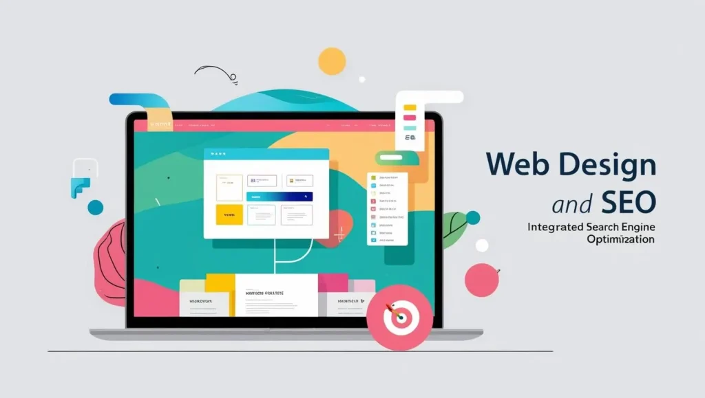
Search Engine Optimisation (SEO) and web design are not separate entities but rather two sides of the same coin. In the modern digital landscape, a well-designed website does not just captivate users with visually appealing aesthetics but also plays a crucial role in ensuring discoverability, accessibility, and engagement. Without proper SEO integration, even the most beautifully designed websites can struggle to gain visibility in search engine results, rendering them ineffective in attracting organic traffic.
A well-structured, SEO-optimised website can significantly improve search engine rankings, enhance user experience, and increase the likelihood of conversions. Businesses that prioritise SEO-driven web design benefit from higher visibility, increased brand credibility, and improved audience reach.
Key Web Design Elements That Affect SEO
To maximise SEO benefits, web design must incorporate several crucial elements that align with search engine algorithms. Below are some of the most critical web design factors that impact SEO performance:
1. Mobile-Friendliness: A Mobile-First Approach
Google’s mobile-first indexing means that the mobile version of a website is prioritised when determining rankings. Since a significant portion of web traffic now comes from mobile devices, a website that is not mobile-friendly will struggle to perform well in search engine results.
To optimise for mobile:
✔ Implement responsive web design so that content adapts seamlessly to different screen sizes.
✔ Use touch-friendly navigation and ensure that buttons and links are easily clickable.
✔ Avoid using pop-ups and intrusive elements that hinder mobile usability.
✔ Ensure that fonts are legible on smaller screens without requiring zooming.
2. Site Structure and Navigation: Enhancing User Experience and Crawlability
A well-organised site structure and intuitive navigation are essential for both user experience (UX) and search engine crawlers. If users struggle to find information or navigate through a website, they are likely to leave, increasing the bounce rate—a factor that can negatively impact SEO.
To optimise site structure and navigation:
✔ Implement a logical and hierarchical URL structure.
✔ Use breadcrumb navigation to help users understand their location within the site.
✔ Ensure that important pages are easily accessible within a few clicks.
✔ Avoid deep navigation structures that make content difficult to find.
3. Fast Loading Speed: A Critical SEO Factor
Website speed is a direct ranking factor in Google’s algorithm. A slow-loading website frustrates users, increases bounce rates, and negatively impacts conversion rates.
To improve page loading speed:
✔ Optimise images by compressing large files without sacrificing quality.
✔ Minimise HTTP requests by reducing unnecessary scripts and stylesheets.
✔ Enable browser caching to store frequently accessed resources.
✔ Use Content Delivery Networks (CDNs) to distribute content efficiently across global servers.
✔ Optimise JavaScript and CSS files by minifying and deferring unnecessary scripts.
4. Optimised Images and Alt Text: Boosting Accessibility and SEO
Search engines cannot “see” images the way humans do, which is why alt text (alternative text) is crucial for image SEO. Alt text provides search engines with descriptions of images, improving accessibility and enhancing search rankings.
Best practices for image SEO:
✔ Use descriptive file names instead of generic ones (e.g., “blue-sports-car.jpg” instead of “image123.jpg”).
✔ Provide keyword-rich alt text that accurately describes the image.
✔ Compress images to reduce file sizes without losing quality.
✔ Utilise modern formats such as WebP for better performance.
5. Internal Linking: Strengthening Website Structure
Internal linking is an often-overlooked SEO strategy that can significantly enhance website navigation, distribute page authority, and help search engines understand site hierarchy.
How to effectively implement internal linking:
✔ Link to relevant and high-authority pages within the website.
✔ Use descriptive and keyword-rich anchor text.
✔ Ensure that all internal links are functional and not broken.
✔ Maintain a logical link flow to guide users naturally through the website.
6. Structured Data Markup: Enhancing Search Visibility
Structured data markup, also known as schema markup, helps search engines understand the content of a website better. By providing detailed information in an organised manner, structured data improves a website’s chances of appearing in rich snippets, featured snippets, and knowledge graphs on Google.
Types of structured data that improve SEO:
✔ Organisation Schema – Displays brand details in search results.
✔ Product Schema – Enhances product listings with price, reviews, and availability.
✔ FAQ Schema – Helps FAQs appear directly in search results.
✔ Review Schema – Enables star ratings to show in search listings.
Trends in Web Design
Web design trends constantly evolve as user behaviour, technology, and industry standards change. Staying updated with the latest design trends ensures that a website remains modern, engaging, and competitive.
1. Minimalist Design: Emphasising Simplicity and Readability
Minimalist design focuses on clean layouts, ample white space, and a clutter-free user interface. This approach enhances readability, improves loading speeds, and creates an intuitive browsing experience.
2. Dark Mode: A Growing Preference Among Users
Dark mode offers a visually striking alternative to traditional light interfaces. Benefits include:
✔ Reduced eye strain, especially in low-light conditions.
✔ Extended battery life for devices with OLED screens.
✔ A sleek and modern aesthetic that enhances brand identity.
3. Micro-Interactions: Enhancing User Engagement
Micro-interactions involve subtle animations, hover effects, and interactive elements that make a website feel dynamic and engaging. Examples include:
✔ Animated hover effects on buttons.
✔ Loading indicators that provide visual feedback.
✔ Smooth transitions that enhance UX.
4. 3D Elements and Custom Illustrations: Creating Depth and Uniqueness
Modern web technologies enable the seamless integration of 3D elements and custom graphics, which create a memorable and immersive user experience.
5. AI-Powered Web Design: The Rise of Automation and Personalisation
Artificial intelligence (AI) is revolutionising web design by:
✔ Automating website creation with AI-driven builders.
✔ Providing real-time personalisation based on user behaviour.
✔ Enhancing customer support through AI-powered chatbots.
6. Voice User Interface (VUI): Adapting to the Voice Search Revolution
As voice search grows in popularity, web designers are incorporating voice-enabled navigation and commands to improve accessibility and enhance user experience.
Conclusion
Web design is a dynamic field that blends creativity and functionality. By focusing on user experience, responsiveness, and SEO-friendly design, you can create websites that not only look stunning but also perform efficiently. Whether you’re a business owner, developer, or designer, staying updated with the latest web design trends will ensure your site remains competitive in the digital landscape.
Investing in a well-thought-out web design strategy will pay off in the long run by enhancing user engagement, improving search rankings, and ultimately driving conversions. Whether you’re revamping an existing site or building one from scratch, prioritising usability, performance, and aesthetics will create a website that stands out in today’s digital world.
Contact Digipixel today to build a website that stands out and drives measurable results.