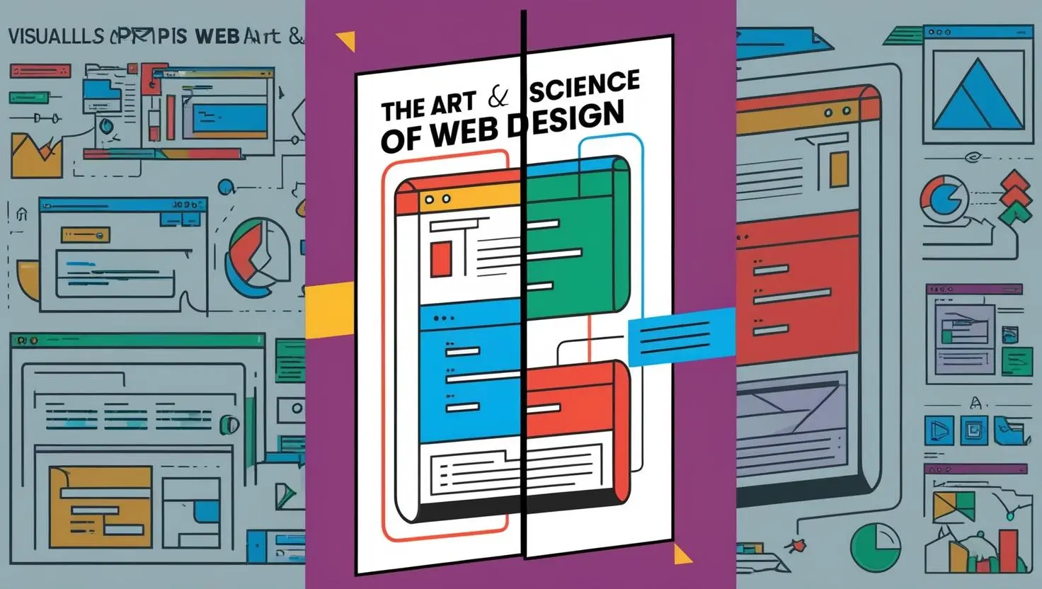
Introduction
In today’s rapidly evolving digital era, web design has far surpassed the simple task of arranging elements on a page. It is now a sophisticated combination of aesthetics, functionality, and user experience, all of which play a crucial role in determining the success of a website. A well-designed website is not just an online presence; it serves as the face of a brand, a tool for communication, and a means to achieve business goals. A website’s design can be the deciding factor in retaining visitors or losing them to competitors, and, as such, web designers must be equipped with the knowledge, skills, and insight to create exceptional online experiences.
With an ever-changing digital landscape, where new technologies, trends, and consumer behaviours emerge constantly, staying informed about the latest developments in web design is essential for businesses, developers, and designers alike. Web design trends come and go, but certain foundational principles remain timeless, offering a solid base on which to build functional, user-friendly, and aesthetically pleasing websites. Understanding these principles and applying them effectively ensures that websites can withstand the test of time and adapt to future innovations.
Whether you are building a website for a business, an e-commerce store, or a personal portfolio, mastering the art and science of web design is essential for creating a platform that is visually appealing, easy to navigate, and optimised for performance. As users become more discerning and as digital tools and technologies continue to evolve, web designers must be equipped not only with technical expertise but also with the creative vision to craft experiences that captivate and engage their target audience. In this guide, we will explore the essential aspects of web design, from the core principles of usability and accessibility to current trends and future innovations that will shape the digital experiences of tomorrow.
The Fundamentals of Web Design
1. User Experience (UX) and User Interface (UI) Design
A great website begins with an exceptional user experience (UX) and an intuitive user interface (UI). These two elements are foundational in determining how users interact with and perceive a website. While they are closely related, UX and UI each play a unique role in shaping the overall website experience.
UX Design: The primary focus of UX design is how users feel when navigating a website. It is about ensuring that users have a smooth and enjoyable experience, free from frustration or confusion. UX design aims to optimise the usability of a website, ensuring that users can complete their tasks efficiently and effectively. This involves everything from navigation to content hierarchy to page load speed. A well-planned UX design ensures that users can find what they need quickly, navigate through the site without obstacles, and engage with the content effortlessly. In essence, UX design ensures that the website aligns with the user’s goals, expectations, and behaviours, enhancing overall satisfaction and driving engagement.
UI Design: While UX focuses on the overall experience, UI design deals with the visual and interactive components of a website. It is concerned with how the website looks and feels, from the colour scheme to the typography, buttons, icons, and overall layout. The objective of UI design is to create an aesthetically pleasing and visually cohesive design that is also functional. UI design plays a crucial role in guiding the user’s attention, ensuring that they are able to easily identify key elements, such as navigation menus, buttons, and forms. It also ensures that the interface is intuitive and that users are able to interact with it effortlessly. When UX and UI are seamlessly integrated, the result is a website that feels both visually appealing and highly functional, resulting in a smooth user journey and higher engagement rates.
When UX and UI design work together harmoniously, users are able to navigate through the site with ease, finding what they need effortlessly. This not only leads to higher levels of user engagement but also increases the likelihood of conversions, whether that means making a purchase, signing up for a newsletter, or filling out a contact form. Both UX and UI should be considered holistically, as they are interdependent and contribute to the overall effectiveness of the website.
2. Responsive Web Design
In today’s digital age, the sheer volume of web traffic coming from mobile devices has made responsive web design a critical aspect of any website development process. Responsive design ensures that a website adapts its layout and content to provide an optimal viewing experience, regardless of the device or screen size being used.
A responsive website is one that is capable of automatically adjusting its design to fit screens of various sizes, including desktops, tablets, and smartphones. By employing responsive web design principles, designers ensure that users can access and interact with the website on any device, without experiencing frustration due to poorly formatted or unresponsive content. This approach not only makes the website more user-friendly but also ensures that users can access the content they need in a way that is both functional and aesthetically pleasing.
Key elements of responsive web design include:
- Fluid Grids: These are flexible layouts that automatically adjust their size in relation to the user’s screen size. Unlike fixed-width grids, which rely on static dimensions, fluid grids use relative units such as percentages to ensure the content scales proportionally.
- Flexible Images: Images are scaled to fit different screen sizes, ensuring that they are not too large or too small on different devices. This can be achieved by using CSS media queries or the
srcsetattribute in HTML, allowing images to load in different sizes based on the screen’s resolution. - Touch-Friendly Navigation: With the rise of mobile devices, it is essential that navigation menus and buttons are easy to interact with using touch gestures. Touch-friendly design includes larger buttons, tap targets, and swipe interactions that enhance usability for mobile users.
- Mobile-First Approach: A mobile-first approach to web design involves designing the website for smaller screens first and then gradually adapting it to larger screens, such as tablets and desktops. This ensures that the mobile experience is prioritised and that the website is fully optimised for the increasingly large segment of mobile web users.
In addition to enhancing the user experience, responsive design is also crucial for SEO. Google prioritises mobile-friendly websites in search rankings, and websites that do not adapt to mobile screens may suffer from lower search engine visibility. As mobile devices continue to dominate internet usage, adopting a responsive design is no longer optional but a necessity for any website aiming to stay competitive in the digital space.
3. Website Performance and Loading Speed
The performance of a website, particularly its loading speed, plays a significant role in user satisfaction and engagement. Studies have shown that slow-loading websites are more likely to experience higher bounce rates, lower engagement, and reduced conversion rates. In fact, users are increasingly impatient when it comes to website loading times, and studies indicate that a delay of even a few seconds can result in visitors abandoning the site altogether.
Website performance optimisation focuses on improving the speed and efficiency of a website’s loading process. Optimising performance not only enhances the user experience but also improves SEO rankings, as search engines like Google take website speed into account when determining search result rankings. A fast-loading website is essential for retaining visitors, ensuring that they stay on the site long enough to engage with the content and complete their desired actions.
Several strategies can be implemented to optimise website performance and loading speed:
- Image Compression: Large images can significantly slow down a website’s loading time. By compressing images without sacrificing quality, designers can reduce their file size, allowing them to load faster. Tools such as image optimisation plugins or online image compressors can help achieve this.
- Minimising HTTP Requests: Every element on a webpage, such as images, scripts, stylesheets, and fonts, requires an HTTP request to be sent to the server. Reducing the number of these elements helps to minimise the time spent on loading a page. This can be achieved by combining files, using CSS sprites for images, or removing unnecessary elements.
- Enabling Caching: By enabling caching, websites can store certain elements locally in the user’s browser, allowing returning visitors to experience faster load times. Caching reduces the need to reload all content each time a user revisits the site, resulting in quicker page loads.
- Content Delivery Networks (CDNs): CDNs are distributed networks of servers that store copies of your website’s content across multiple locations. By serving content from a server that is geographically closer to the user, CDNs can significantly reduce loading times and improve overall performance.
- Minifying Code: Minifying CSS, JavaScript, and HTML files by removing unnecessary whitespace, comments, and redundant code helps to reduce file sizes, which leads to faster loading times. This is a simple but effective technique for improving website speed.
By focusing on website performance and loading speed, designers can ensure that their websites offer a smooth and enjoyable experience for users. Furthermore, optimising performance is a key factor in improving SEO rankings and maintaining a competitive edge in the digital marketplace.
The Role of Web Design in Branding
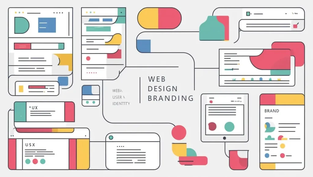
1. Consistency in Design
One of the most important aspects of effective web design is consistency. A website must consistently reflect a brand’s identity, ensuring that users can instantly recognise the brand the moment they land on the site. Consistency in design encompasses various elements, including colour schemes, typography, imagery, and layout.
A consistent design establishes a cohesive visual language that reinforces the brand’s message and values. This consistency helps users feel more comfortable navigating the website, as they can easily identify familiar elements and understand how to interact with the site. For example, consistent use of colours and fonts across the site creates a sense of unity and professionalism, making the brand more memorable to users.
2. Colour Psychology in Web Design
Colours are powerful tools in web design, as they evoke emotions and influence user behaviour. Different colours can have a significant impact on how users perceive a brand and can even affect their decision-making process. By understanding colour psychology, designers can select the right colour scheme to reinforce the brand’s identity and encourage specific actions from users.
For example:
- Blue is often associated with trust, professionalism, and stability. It is commonly used by financial institutions and healthcare providers to convey reliability.
- Green symbolizes growth, health, and sustainability. It is frequently used by brands in the environmental, health, and wellness industries.
- Red creates a sense of urgency and excitement. It is often used for call-to-action buttons and promotions, prompting users to take immediate action.
Choosing the right colour scheme is crucial, as it can influence user emotions and drive engagement. For instance, an ecommerce site selling organic products might use green to evoke feelings of freshness and sustainability, while a technology website might choose blue to convey trust and innovation. Colours can be used strategically to enhance branding, create visual harmony, and encourage user interaction.
3. Typography and Readability
Typography plays a vital role in web design, influencing how content is presented and consumed by users. Clear, readable typography ensures that users can quickly and easily absorb the information on a website. Poor typography, on the other hand, can lead to frustration and a negative user experience.
Best practices for typography in web design include:
- Choosing Readable Fonts: It is important to choose fonts that are legible across different screen sizes and resolutions. Fonts should be easy on the eyes and support a smooth reading experience.
- Consistent Font Sizes: Headings, subheadings, and body text should all have distinct and consistent font sizes to create a clear content hierarchy.
- Sufficient Contrast: Ensuring enough contrast between text and background is crucial for readability, particularly for users with visual impairments. Text should stand out clearly against its background, making it easy for users to read without straining their eyes.
By focusing on typography and readability, designers can ensure that visitors stay engaged with the content and have a positive experience on the site. Clear typography enhances comprehension and retention, making it an essential element of effective web design.
In conclusion, web design is an intricate, multifaceted process that requires a balance of creativity, technical knowledge, and a deep understanding of user behaviour. By considering the key principles of UX/UI design, responsive design, website performance, branding, and typography, web designers can create websites that not only look great but are also functional, accessible, and optimised for success. As the digital landscape continues to evolve, staying informed about emerging trends and technological advancements is crucial for maintaining a competitive edge and creating websites that provide users with exceptional experiences.
Emerging Web Design Trends
In today’s ever-evolving digital landscape, web design has seen numerous transformations. What was once considered cutting-edge design has quickly become obsolete as new technologies, tools, and user preferences emerge. Staying ahead of the curve and adopting emerging web design trends is essential for businesses, designers, and developers who wish to create engaging, modern, and user-centric websites. The following are some of the most influential trends that are shaping the future of web design and the web experience.
1. Dark Mode and Colour Customisation
One of the most noticeable trends in modern web design is the adoption of dark mode. With its ability to reduce eye strain, conserve battery life, and provide a sleek, stylish aesthetic, dark mode has gained immense popularity among users across various platforms. Many websites now offer users the ability to toggle between light and dark modes, allowing them to personalise their viewing experience based on preference or environmental factors. The growing prevalence of dark mode is indicative of a shift toward user-centred design, where websites strive to enhance comfort and offer flexible, customisable viewing options.
Dark mode provides several benefits, especially for long-term usage of websites. It reduces the amount of light emitted from the screen, which can be less straining on the eyes, particularly in low-light environments. This mode is especially favoured by users who spend extended hours on websites, such as developers, gamers, or readers. Additionally, the use of dark mode is often associated with a more modern, sophisticated look, making websites feel fresh and aligned with contemporary design sensibilities.
Colour customisation, in tandem with dark mode, is also gaining traction. Allowing users to personalise colour schemes, themes, or contrast levels can enhance the accessibility of a website while enabling users to have a more tailored experience. The trend towards customisation reflects an increasing focus on user autonomy and the desire to create a more inclusive and user-centric digital environment.
2. Minimalist Design
“Less is more” is the mantra of minimalist design, a philosophy that has permeated not only web design but many other creative disciplines as well. Minimalism in web design is all about reducing clutter, focusing on essential elements, and allowing users to interact with the content in a streamlined and effortless manner. Websites with minimalist design principles aim to provide a clean, visually appealing layout that is not overwhelmed by unnecessary elements.
One of the key characteristics of minimalist design is the use of ample white space, which provides breathing room for content, improves readability, and gives the website a fresh, modern feel. The strategic use of whitespace enhances user focus, enabling visitors to engage with content without distraction. In minimalist websites, every element is carefully curated, from typography to images to buttons, ensuring that nothing detracts from the core purpose of the site.
Minimalist design also often incorporates simple navigation, clear calls to action, and user-friendly layouts. With fewer elements to process, users are able to engage with the site more quickly, leading to a more satisfying user experience. Furthermore, minimalist websites tend to load faster because there is less visual complexity to render, which aligns with the growing importance of web performance.
While minimalist design champions simplicity, it doesn’t mean that the site should lack personality. On the contrary, designers use subtle, refined details to express a brand’s identity through carefully chosen colours, typography, and imagery. This balance of simplicity and elegance has made minimalist design a go-to choice for modern web projects, especially for brands looking to convey sophistication and professionalism.
3. Micro-Interactions
Micro-interactions are the small, often subtle animations or design elements that respond to user actions on a website. They can include things like a button changing colour when hovered over, a subtle animation when a user submits a form, or a notification appearing after a successful action. These micro-interactions serve to provide feedback to users, guide them through the site, and make the overall experience feel more interactive and engaging.
While micro-interactions might seem insignificant at first glance, they can have a significant impact on user experience. They help users understand the consequences of their actions, whether it’s a successful form submission or a button press. Micro-interactions can make a website feel more responsive and intuitive, creating a sense of satisfaction and accomplishment for users.
These small animations can also contribute to a website’s personality, making it feel more lively and engaging. They add an element of fun and surprise, which can enhance the emotional connection users have with a brand. However, micro-interactions should be used sparingly and purposefully, as excessive animations or overly complicated interactions can detract from the user experience and lead to frustration.
When executed correctly, micro-interactions can enhance usability by providing users with the visual feedback they need to understand their interactions with the site. They also play a role in guiding users through complex processes, such as completing a multi-step form or navigating a product selection process.
4. 3D Elements and Immersive Experiences
Advancements in web technologies, including WebGL and CSS3, have made it easier than ever to incorporate 3D elements, animations, and immersive visuals into websites. These technologies allow designers to create rich, interactive experiences that draw users into the content and create a more engaging environment.
3D elements can take many forms, from interactive product models that users can rotate and explore, to complex visual effects that add depth and movement to the page. Websites that incorporate 3D elements often feel more dynamic and captivating, making them ideal for industries like gaming, entertainment, and e-commerce, where immersive experiences are key to attracting and retaining users.
These advancements also allow designers to create websites that feel more lifelike and realistic. For instance, e-commerce sites can use 3D product views to give customers a better sense of what they are purchasing, helping to drive conversions. Similarly, creative agencies and portfolios can leverage 3D graphics and animations to showcase their work in more compelling and interactive ways.
Beyond 3D elements, designers are increasingly incorporating immersive technologies like augmented reality (AR) and virtual reality (VR) into their websites. With AR, for example, users can interact with products in their real-world environment before making a purchase, while VR can transport users into a fully immersive digital space. As internet speeds increase and browsers become more capable, these technologies are expected to play an even larger role in shaping the future of web design.
5. AI and Chatbots
Artificial Intelligence (AI) is rapidly transforming the way websites are designed and experienced. One of the most notable implementations of AI in web design is the use of chatbots, which provide users with instant customer support. Chatbots can answer frequently asked questions, assist with troubleshooting, and guide users through various tasks on the website, all without the need for human intervention.
Chatbots can be programmed to provide personalised responses based on user behaviour and preferences, making them more efficient and user-friendly. For example, an e-commerce site might use a chatbot to recommend products based on a customer’s previous purchases, or a customer service chatbot might be able to offer tailored solutions based on the user’s browsing history.
AI is also being used to personalise websites on a much deeper level. Through machine learning and data analysis, websites can adapt their content and design based on individual user preferences, behaviours, and interactions. This allows businesses to create more engaging and relevant experiences, increasing the likelihood of conversions and long-term user satisfaction.
As AI continues to improve, the potential for its application in web design will only grow. From personalisation to automation, AI-driven tools are becoming indispensable for creating smarter, more efficient, and user-centric websites.
SEO and Web Design: The Connection
In today’s competitive digital landscape, creating a visually stunning website is only part of the equation. To be truly effective, a website must also be discoverable. This is where the integration of SEO (Search Engine Optimisation) principles into web design comes into play. Web design and SEO are two sides of the same coin, influencing each other to help websites rank higher in search engine results, attract organic traffic, and provide a better user experience.
SEO involves optimising a website’s content and structure so that it ranks highly on search engines like Google. However, many aspects of web design, such as site structure, performance, and mobile responsiveness, can significantly impact how search engines rank a site. By understanding the relationship between web design and SEO, designers can create websites that are both visually appealing and SEO-friendly.
Key Web Design Elements That Impact SEO
- Mobile-Friendliness: With mobile-first indexing, Google prioritises mobile-friendly websites in search rankings. Websites that are not optimised for mobile devices are at a significant disadvantage when it comes to SEO. A mobile-responsive design ensures that users can access content on any device, which is crucial for both user experience and search engine rankings.
- Site Structure & Navigation: A well-structured website not only makes it easier for users to find content but also helps search engines index the site more effectively. Clear and intuitive navigation, coupled with a logical site structure, ensures that both users and search engine crawlers can easily find and understand content.
- Fast Loading Speed: Search engines like Google take page loading speed into account when ranking websites. Faster websites tend to have lower bounce rates, higher user engagement, and better rankings. Optimising images, reducing HTTP requests, and using caching techniques can all contribute to improving website loading times.
- Optimised Images: Images play a crucial role in enhancing the visual appeal of a website, but they can also impact performance if not optimised properly. By adding alt text to images, designers improve both accessibility and SEO, as search engines can index the content of the images.
- Internal Linking: Internal links help search engines understand the relationship between pages on a website. By linking to relevant pages within the site, web designers can help distribute ranking power across the entire website, improving the overall SEO performance.
- Schema Markup: Structured data, or schema markup, helps search engines understand the content of a webpage more effectively. By adding schema markup to a website, designers can improve visibility in search results, enhance rich snippets, and boost click-through rates.
By integrating SEO best practices into web design, businesses can attract organic traffic and improve user engagement.
Future of Web Design
As technology continues to advance at a rapid pace, the future of web design holds exciting possibilities. Several emerging technologies and trends are poised to reshape the way websites are designed and experienced. Here’s a look at some of the key innovations on the horizon:
- Voice User Interfaces (VUI): With the rise of voice assistants like Amazon Alexa and Google Assistant, voice search and voice commands are becoming increasingly important. Websites will need to adapt their design to accommodate voice interactions, optimising for voice search queries and providing voice-controlled navigation options.
- Augmented Reality (AR) and Virtual Reality (VR): AR and VR technologies are already making waves in industries like gaming, retail, and real estate. In the future, websites will become more immersive, incorporating AR and VR elements to provide users with interactive and engaging experiences.
- Personalisation with AI: AI-driven personalisation will become more sophisticated, allowing websites to dynamically adapt to individual user preferences and behaviours. From content recommendations to product suggestions, websites will increasingly tailor the user experience to meet the needs of each visitor.
As these technologies evolve, web design will continue to prioritise user experience, interactivity, and innovation.
Conclusion
Web design is an ever-evolving field that combines creativity, functionality, and cutting-edge technology to create engaging and user-friendly websites. The trends highlighted above are just a glimpse into the future of web design, where user experience, performance, and personalisation will continue to be at the forefront of innovation.
Whether you are building a new website or redesigning an existing one, it is essential to stay updated with emerging trends, embrace new technologies, and prioritise the needs of your users. By doing so, businesses and designers can ensure that their websites not only look great but also provide seamless, personalised, and interactive experiences that stand out in the increasingly competitive digital landscape.
Contact Digipixel today to build a website that stands out and drives measurable results.