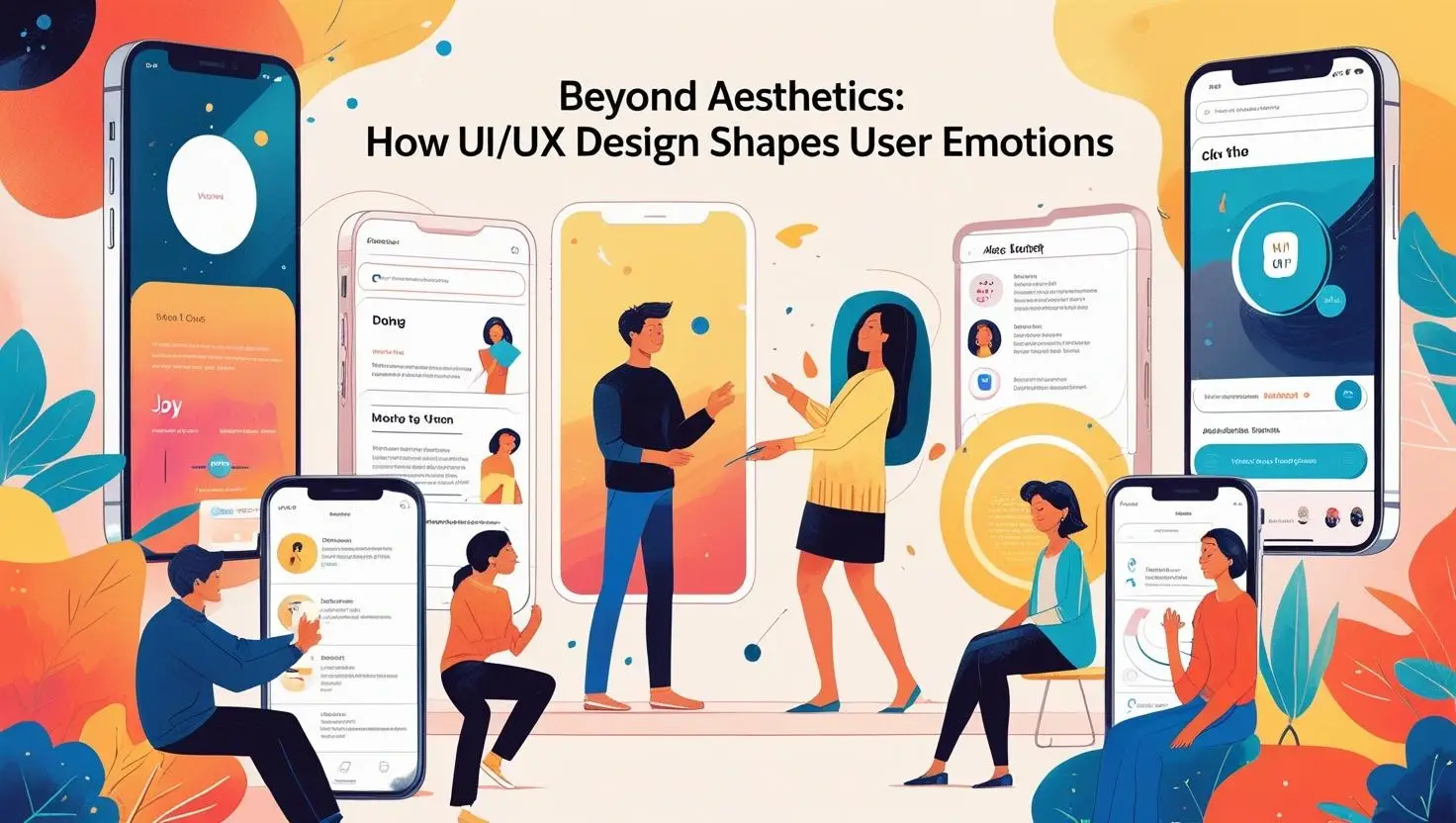
The Emotional Power of UI/UX Design
Great UI/UX design does more than guide users through an app or website. It stirs feelings, builds trust, and creates memorable moments. When designed thoughtfully, every interaction can shape a user’s mood.
Whether it’s joy from a smooth checkout or frustration from unclear navigation, emotions are triggered with every tap, swipe, and scroll. Users rarely remember just the visuals—they remember how your product made them feel.
First Impressions Set the Emotional Tone

The moment a user lands on a site, emotions kick in. Colours, typography, and spacing all speak silently, shaping perception. Bright colours may spark excitement, while soft hues create calm and trust.
A cluttered interface can cause anxiety or overwhelm, Clean, clear layouts build confidence and encourage exploration. First impressions are emotional impressions, setting the stage for the entire experience.
Microseconds matter. Users decide quickly whether they feel welcome, confused, or inspired. This emotional snap judgement influences how long they stay and whether they engage or bounce.
Microinteractions: Small Gestures, Big Feelings
Microinteractions—those tiny animations, button responses, or loading cues—are emotional triggers. They tell users the system is alive, listening, and responsive to their actions. This reduces uncertainty and stress.
A gentle bounce when you pull to refresh, or a soft vibration when a message sends, reassures users that their commands worked. These tiny moments build trust and connection.
Neglect microinteractions, and users may feel lost or ignored. Well-crafted ones make digital experiences feel warm and human, turning routine tasks into pleasant rituals.
Colour and Typography as Emotional Tools
Colour choice shapes mood. Warm reds and oranges can energise, while blues and greens soothe and relax. The right palette evokes the desired emotional response immediately.
Typography matters too. Bold fonts command attention, while light, airy type creates elegance and calm. Font size, weight. and spacing guide how information feels as well as how it reads.
An effective combination of colour and type builds personality. It makes brands feel playful, serious, luxurious, or friendly—without a word being spoken.
Poor choices here create discomfort or confusion. Consistency ensures users feel secure and confident throughout their journey.
Navigation and Emotional Comfort
Navigation design is emotional design. Clear, predictable menus reduce frustration and make users feel in control. Confusing paths cause doubt, hesitation, and irritation.
Breadcrumb trails, search bars, and logical flows help users relax. They know where they are, where they’ve been, and where to go next. This sense of direction builds satisfication.
Overly hidden menus or experimental layouts can frustrate. Innovation is great—but not if it leaves users feeling lost or powerless. Emotional comfort depends on clarity.
Familiarity breeds confidence. When navigation feels intuitive, stress drops, and positive feelings grow.
The Danger of Emotionally Cold Design
Sleek, minimalist designs can sometimes feel distant. When everything is stripped down, users may feel disconnected or unimportant. Emotionless interfaces miss the chance to engage hearts.
Cold design creates doubt. Users wonder if they’re clicking the right button or using the feature correctly. Without warmth, there’s no bond between user and brand.
Emotionally rich design uses language, visuals, and feedback to build relationships. Warm microcopy, playful animations, and empathetic messages turn digital tools into trusted companions.
Users want to feel seen and understood—not just processed by a machine. Emotional design bridges that gap.
Designing for Delight and Surprise
Delight is an emotional amplifier. Unexpected animations, clever transitions, or small rewards turn routine tasks into joyful moments. These surprises keep users engaged and smiling.
Spotify’s wrapped summaries or Duolingo’s playful owl are famous examples. These emotional touches make users want to return—not because they have to, but because they enjoy the experience.
However, delight must never overwhelm function. It must enhance, not distract. Surprise without purpose risks irritation rather than pleasure.
Balance is key. Small, thoughtful delights make a big emotional impact when used sparingly and meaningfully.
The Roles of Error Messages in Emotional UX
Error states are emotional flashpoints. A cold, vague “404” page frustrates users. But a helpful, friendly message reduces tension and keeps users calm.
Clear error explanations guide users forward. Humour or empathy can ease irritation and turn failure into a gentle nudge rather than a hard stop.
Error design should reassure, not blame. It should offer solutions and next steps, showing users that mistakes are normal and fixable.
Well-handled errors protect the emotional flow. Poor ones break it—and can drive users away.
Emotional Consistency Across Devices
Cross-platform consistency maintains emotional trust. A user should feel the same reassurance whether on desktop, tablet, or mobile. Sudden design shifts confuse and unsettle.
Fonts, colours, microinteractions, and navigation must carry the same emotional tone everywhere. This stability builds familiarity and comfort.
Inconsistent design disrupts the emotional journey. Users hesitate when things look or feel wrong. Consistency keeps them relaxed and confident.
Emotional reliability is as important as functional reliability in today’s multi-device world.
Conclusion: Designing for the Human Heart
UI/UX is no longer just about function. It is about feeling. Users want connection, trust, and joy—not just convenience. The best designs recognise this human need.
Emotional design builds loyalty. It makes users feel cared for and understood, turning casual visitors into lifelong fans. ignoring emotion risks losing that bond.
Every button, colour, word, and animation shapes how users feel. These choices decide whether they smile, sigh, or leave. Designing for the heart is designing for success.
In 2025 and beyond, the brands that win will be those that put emotional experience at the core of their UI/UX.
Contact Digipixel today to build a website that stands out and drives measurable results.