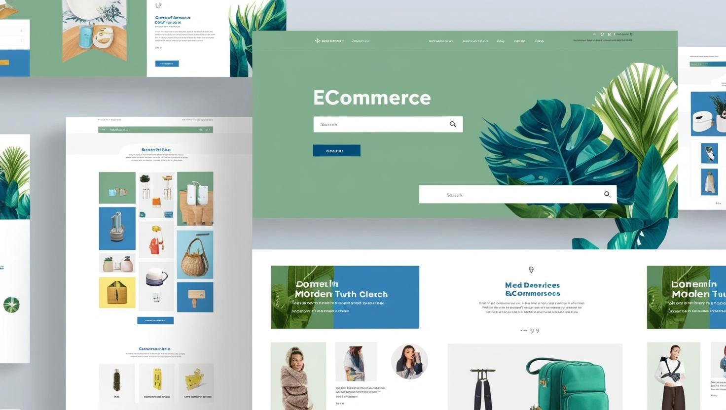
The eCommerce landscape in Singapore has seen explosive growth in recent years. With consumers increasingly shopping online for everything from groceries and electronics to luxury items and home services, digital storefronts are no longer optional—they are essential. But while getting traffic to your website is important, converting that traffic into paying customers hinges on one critical factor: User Experience (UX).
In a market as competitive and digitally savvy as Singapore, where 88% of the population are internet users and smartphone penetration exceeds 90%, delivering a seamless and intuitive eCommerce experience is key. From speed and accessibility to trust signals and mobile optimisation, every detail matters.
Here’s your eCommerce UX Checklist: 10 things every Singapore-based online store must get right in 2025 and beyond.
1. Lightning-Fast Loading Speed
Speed dis no longer a luxury , it’s a non-negotiable. A delay of even a second can lead to cart abandonment and lost of trust. According to Google, a site that takes more than 3 seconds to load could lose over 50% of its visitors. In Singapore, where fibre broadband and 50% of it visitors. In Singapore, where fibre broadband and 5G connectivity are widely accessible, users are accustomed to instantaneous experiences.
UX Tip:
- Use tools like Google PageSpeed Insights or GTmetrix to test your site.
- Compress images, minimise scripts, and use a content delivery network (CDN).
Choose fast, reliable local hosting optimised for Singapore traffic.
2. Mobile-First Design
Singaporeans today are practically glued to their smartphones—whether they’re commuting on the MRT, queuing for kopi, or relaxing before bed, mobile browsing is deeply embedded in daily life. In fact, mobile commerce (m-commerce) has surpassed desktop usage in most eCommerce verticals, with users expecting a seamless, intuitive, and fast experience on smaller screens. For online store owners, this means one thing: mobile UX is not just important—it’s absolutely critical to success in Singapore’s digital marketplace.
Gone are the days when having a “mobile-friendly” site was good enough. In 2025, your online store must be fully responsive, built with mobile-first principles in mind. This means designing with the mobile user as your primary audience, not as an afterthought. Any friction—whether it’s a button that’s too small to tap, text that’s hard to read, or a slow-loading checkout—can and will cause your visitors to abandon their carts and head to a competitor.
UX Tip:
- Make your layout fluid and responsive, using flexible grids and media queries to ensure your site adapts beautifully to any screen size—from iPhones to Android tablets.
- Use large, clearly labelled, and tappable buttons that don’t require users to zoom in or perform pixel-perfect taps with their pinky.
- Prioritise vertical scrolling over horizontal swiping. It aligns with natural thumb movement and allows faster content scanning.
- Keep navigation minimal and thumb-friendly, especially for menu icons and CTAs (calls-to-action). Position them within the “thumb zone” where users naturally interact.
- Avoid intrusive pop-ups, especially those that are hard to close or cover key content. If you must use one (for promotions or newsletter signups), ensure there’s an obvious close button that doesn’t overlap other elements.
- Compress images and optimise loading speed. Mobile users are quick to bounce from slow-loading pages. Use tools like WebP image formats and lazy loading techniques to boost performance.
According to the Infocomm Media Development Authority (IMDA), over 70% of online retail traffic in Singapore now comes from mobile devices—a trend expected to grow even further as Gen Z and Millennials dominate digital consumption. Moreover, Singapore’s Smart Nation infrastructure has created an environment where everything from QR payments to ride-hailing and grocery shopping is handled effortlessly on mobile.
This means any shortcomings in your mobile UX are direct threats to your revenue stream. A slow, clunky, or confusing mobile experience isn’t just a minor inconvenience—it’s a business liability. Singaporean users are highly discerning and used to world-class digital experiences, thanks to local and international brands investing heavily in mobile optimisation.
If your eCommerce platform isn’t keeping pace, you’re not just losing a sale—you’re potentially losing a loyal customer for good.
3. Clear and Intuitive Navigation
Nothing sends potential customers away faster than a confusing website layout. In eCommerce, time is money—and if a user lands on your site and can’t quickly find what they’re looking for, they’re highly likely to bounce and move on to a competitor. Navigation isn’t just a convenience; it’s a core component of your store’s conversion strategy.
When we talk about navigation, we’re not only referring to your top menu. It includes your category structure, filters, breadcrumbs, internal linking, and even the performance of your search function. Every element must work together to guide your visitors—whether they’re browsing casually or searching with intent—to the right product pages with as few clicks and scrolls as possible.
UX Tip for Clear and Intuitive Navigation:
- Use Mega Menus for larger product catalogues. If your store offers numerous categories (e.g. men’s, women’s, kids’, accessories, clearance), a well-structured mega menu allows customers to see all options at a glance—without feeling overwhelmed or buried in submenus.
- Limit top-level navigation to 5–7 items. Cognitive psychology tells us that people struggle to retain more than 7 items at a time. Keep your primary navigation clean and focused, using dropdowns for secondary options.
- Include a prominent search bar, ideally in the top right corner or fixed in a sticky header. Make sure it includes autocomplete suggestions and handles misspellings gracefully—customers shouldn’t have to type exact product names to find what they want.
- Use filtering and sorting options on category pages (e.g. by price, popularity, new arrivals, brand). These help narrow down choices, especially on mobile where screen space is limited.
- Breadcrumbs matter. Allow users to easily backtrack to parent categories or home without restarting their journey.
- Include visual cues. Icons, clear labels, and hover effects help users intuitively understand how to move around your site—even if they’re first-time visitors.
Local Insight – Singapore Shopping Habits:
Singaporeans are incredibly efficient and goal-driven shoppers, especially during high-traffic periods like 11.11 (Singles’ Day), Chinese New Year (CNY), and the Great Singapore Sale (GSS). During these times, online behaviour shifts toward urgency—users are often comparing deals across multiple stores and expect fast, frictionless navigation.
In such a competitive digital environment, even a slight delay in finding a product can push your potential buyer into the arms of a rival brand. Singapore’s consumers are also highly mobile-savvy—many are browsing during commutes or in short bursts between tasks, so every click and second counts.
Take cues from leading local platforms like Shopee Singapore, Zalora, or Love, Bonito, which structure their menus and navigation with precision. They don’t overload users with options at once but instead guide them down a logical and efficient path. The user never feels lost, even with hundreds or thousands of SKUs available.
4. Seamless Checkout Process
The checkout process is where many Singapore eCommerce sites lose customers. A complicated, multi-step checkout with mandatory registration or unclear shipping options can be conversion suicide.
UX Tip:
- Offer guest checkout as default.
- Reduce form fields—only ask for necessary information.
- Use progress indicators and autofill features.
Integrate local payment options like PayNow, GrabPay, and Atome alongside credit card payments. Also, be transparent about shipping times, especially when fulfilling from overseas warehouses.
5. Trust Signals and Security
With rising cyber threats and scams, especially in Southeast Asia, Singaporean consumers are becoming more cautious about online shopping. If your website looks shady or lacks credibility, they’ll exit in seconds.

UX Tip:
- Display SSL certificate indicators (https://).
- Include reviews, testimonials, and recognisable trust badges (e.g. Shopify Secure, Norton Secured).
- Add clear return/refund policies, shipping info, and customer service contacts.
Consumers are more likely to trust businesses that are registered with ACRA or that carry Enterprise Singapore trust marks. Show proof of local legitimacy where possible.
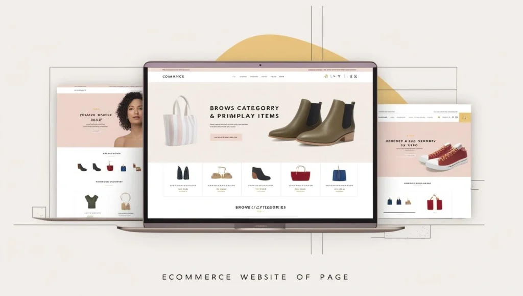
6. High-Quality Product Images and Descriptions
Online shoppers cannot physically touch or test products—so they rely heavily on visuals and copy. Low-resolution images or vague descriptions can drastically impact conversions.
UX Tip:
- Provide multiple high-res images from different angles, with zoom capabilities.
- Use videos or 360-degree views where appropriate.
- Write detailed, benefit-driven product descriptions tailored to local needs (e.g., “ideal for Singapore’s humid climate”).
Bonus Tip:
Use contextual imagery with local relevance—e.g. furniture photos with Singapore-style HDB backdrops or models of different Southeast Asian ethnicities.
7. Optimised Search and Filtering
If your customers can’t quickly narrow down their choices, they’ll get overwhelmed or frustrated. This is especially important for stores with many SKUs.
UX Tip:
- Enable dynamic filters for price, brand, size, and availability.
- Provide keyword-based search with error tolerance and AI suggestions.
- Let customers sort results (e.g. “Lowest Price First” or “Best Seller”).
With limited leisure time, Singaporean consumers appreciate precision. Tailored search helps users find what they want faster—reducing bounce rates and boosting sales.
8. Smart Personalisation
Singaporean shoppers are highly connected and expect curated experiences, similar to what they receive on platforms like Lazada, Shopee, or Zalora. Personalisation is no longer an add-on.
UX Tip:
- Use cookies and browsing history to recommend products.
- Show “Recently Viewed” or “You Might Also Like” sections.
- Offer location-based promotions or language toggles (e.g. English, Simplified Chinese).
Always stay compliant with PDPA (Personal Data Protection Act). Be transparent about data usage and give customers control over their data preferences.
9. Responsive Customer Support
Whether it’s a product query or payment issue, real-time assistance can mean the difference between retaining or losing a customer. Singaporean consumers are quick to abandon a store if help is unavailable.
UX Tip:
- Include live chat support or integrate with WhatsApp Business.
- Offer clear FAQs and self-help articles.
- Use chatbots for off-hours, but make escalation to a human easy.
Singaporeans value efficiency. Fast, helpful service is one of the top factors that influence online brand loyalty.
10. Consistent Branding and Clean Design
Your website is much more than just a digital storefront; it’s a direct reflection of your brand identity. If your site looks inconsistent or outdated, it can negatively affect how users perceive your business. In fact, a lack of professionalism in design can erode trust, making your online store seem untrustworthy or even illegitimate.
Consistency is key in every aspect of your design. Whether it’s the colour palette, fonts, or layout, a unified approach not only builds brand recognition but also helps users navigate your site with ease. A professional design with modern touches signals to your customers that you are serious about quality and that they are in safe hands when shopping with you.
The aesthetic of your website must mirror your brand values while being user-friendly, functional, and visually appealing. After all, a clean, aesthetically pleasing design enhances the overall shopping experience, while a chaotic, mismatched site can quickly push customers to leave.
UX Tips for a Polished and Consistent Design:
- Stick to a coherent brand palette—limit your colours to a few complementary tones and avoid clashing hues that can make the design appear overwhelming. Using too many bright colours can also create visual dissonance.
- Use typography wisely. Choose two to three complementary fonts at most. One for headings and one for body text, and possibly a third for accents. Too many fonts can appear chaotic and detract from the user experience.
- Whitespace is your friend. Don’t crowd your pages with too much content or too many images. A cluttered layout can overwhelm users and detract from the primary calls to action. Ensure each element has room to breathe, helping users focus on what’s important.
- Ensure your branding feels modern and mobile-optimised. With mobile commerce dominating the landscape, ensure your fonts, buttons, and overall design are legible and easy to interact with on smaller screens. A sleek, minimalist approach that is intuitive to use on a mobile device will significantly boost your site’s performance.
- Polish your images and media. High-quality visuals are crucial for an eCommerce site. Ensure that product images are clear, high-resolution, and consistent in style. Avoid generic stock images that don’t fit your brand identity.
Singaporeans are incredibly design-conscious and digitally literate. The nation’s tech-savvy population is accustomed to high standards of digital design, thanks to exposure to international and local brands that understand the importance of sleek, minimalistic aesthetics. For Singaporean consumers, first impressions matter, and a website’s design plays a significant role in whether they choose to trust your store or not.
A modern, minimalist aesthetic often outperforms loud, cluttered layouts. Singaporeans prefer clean, crisp designs with clear navigational cues, and they tend to appreciate simplicity over complexity. For instance, local brands like Love, Bonito and Zalora have set a high bar for eCommerce design, often relying on large images, simple typography, and well-thought-out whitespace to create a sophisticated shopping experience.
This design philosophy isn’t just about looks; it’s about making sure that your site’s visual elements don’t distract from the key goal—helping customers find and buy products as quickly as possible. Your online store should feel polished, easy to navigate, and in line with the expectations of a digitally-savvy Singaporean shopper.
Conclusion : UX Is Not Just About Looks – It’s About Results
eCommerce UX isn’t just about aesthetics or making your website “look nice.” It’s about crafting a purposeful, seamless digital journey that builds trust, reduces friction, and delivers meaningful convenience at every touchpoint. From the moment a user lands on your homepage to the final payment confirmation screen, every interaction should feel intuitive, secure, and satisfying. A beautiful layout may attract attention, but it’s the quality of the experience that truly keeps users engaged—and converts them into paying customers.
In Singapore’s dynamic digital economy—where tech-savvy consumers are constantly comparing options and switching platforms at the slightest inconvenience—user experience has become one of the most critical differentiators between a high-performing online store and one that struggles to convert or retain its visitors. With so many alternatives just a click away, even small usability issues can lead to lost revenue, negative reviews, and poor word-of-mouth. The stakes are especially high during peak sales periods like 11.11, Christmas, or the Chinese New Year shopping rush, when expectations are even higher, and patience is lower.ity.