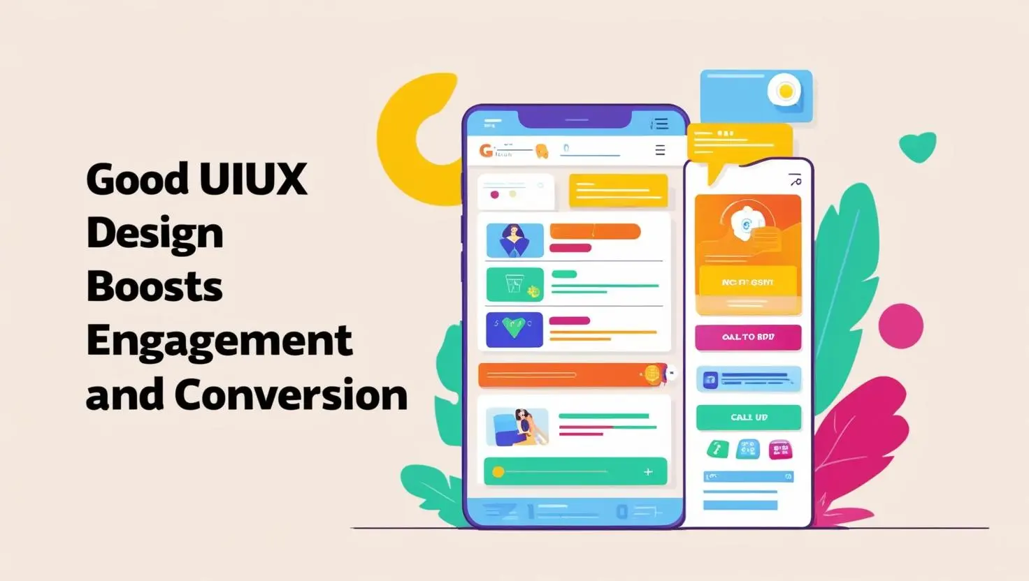
Introduction
In today’s fast-paced, hyper-connected digital ecosystem, where consumers are constantly bombarded with options, information, and distractions at every swipe and click, the design of your website or application is no longer just a matter of aesthetics—it is a strategic necessity. Whether you’re running an e-commerce store, a B2B platform, a mobile app, or a SaaS solution, the way your digital product looks and feels can be the determining factor between a loyal customer and a lost opportunity. As the online landscape grows increasingly competitive, businesses that prioritise exceptional UIUX design (User Interface and User Experience design) set themselves apart from the crowd. These organisations understand that design is not merely decoration—it’s a language. It communicates trust, ease, efficiency, and professionalism. By offering seamless, engaging, and intuitive experiences, businesses can increase user satisfaction, elevate brand perception, and most importantly, drive meaningful outcomes such as higher engagement, improved retention, and increased conversion rates. But what exactly makes a UIUX design “good”? Why is it so powerful in influencing how users behave, how long they stay, and whether they take the action you want them to? And how can you leverage thoughtful, data-informed UIUX design practices to not just meet expectations, but exceed them? This comprehensive guide delves deep into the world of UIUX design, examining how it can become the driving force behind digital success. We’ll explore the critical ways in which design impacts engagement, why first impressions matter more than ever, and how small, intentional design decisions can dramatically increase your conversion metrics. From visual hierarchy and usability to mobile responsiveness and emotional connection, we’ll break down the mechanics behind outstanding UIUX and show you how to apply these principles to your own digital products. Whether you’re a business owner, marketer, product manager, designer, or developer, understanding the direct link between UIUX and user behaviour is crucial to staying ahead in today’s digital economy. Simply put: if you’re not designing for your users, you’re designing for failure. Now, let’s start with the basics—what exactly is UIUX design, and why is it so critical to your online success?
Understanding UIUX Design: A Brief Overview
Before we can fully appreciate the impact of UIUX on engagement and conversion, we must first clearly define what UIUX design actually involves. Many people use the terms interchangeably or assume they refer to the same concept. While they are deeply interconnected, User Interface (UI) and User Experience (UX) refer to distinct, yet complementary, aspects of digital product design. UI Design is concerned with the visual and interactive elements of a digital product. It encompasses everything that the user sees and interacts with on the screen, including layout and structure of pages, colour schemes and contrast, typography and font hierarchy, button styles and icons, navigation menus and sidebar designs, animation and visual feedback. Good UI design ensures that a product is not only visually appealing but also consistent, accessible, and reflective of the brand identity. It creates a pleasing aesthetic that enhances clarity and draws attention to key elements without overwhelming the user. UX Design focuses on the overall journey and user satisfaction. It considers the broader experience of interacting with a website or app, including how easy it is to accomplish specific tasks, how intuitive the navigation feels, whether the content is relevant and useful, how quickly users can achieve their goals, and the emotions users experience throughout their interaction. UX design involves user research, testing, feedback loops, and continual improvement. It strives to eliminate pain points, reduce confusion, and make every interaction feel effortless and rewarding. When these two disciplines work in harmony, the result is a digital product that not only looks great but feels effortless to use. Users don’t just enjoy the appearance—they understand it instinctively. They don’t get lost or frustrated—they feel empowered. This synergy is what separates a mediocre website from one that delights, engages, and converts. In short, UIUX design is the engine behind meaningful digital engagement and effective business performance.
Why UIUX Design Matters for Engagement

In the realm of digital marketing, web development, and online business strategy, the term “engagement” carries substantial weight. Engagement isn’t simply about attracting users to your website or application—it’s about capturing their attention, holding it, and encouraging them to interact meaningfully with your content or features. The quality of that interaction—how intuitive, seamless, and enjoyable it feels—determines whether users become regular visitors, loyal customers, or enthusiastic advocates for your brand. At the heart of sustained engagement lies a powerful catalyst: exceptional UIUX design.
User Interface (UI) and User Experience (UX) design work together to create digital environments that are not only functional but also deeply satisfying to navigate. When UIUX is prioritised and implemented thoughtfully, it enhances every element of the user’s journey. From the moment someone lands on your homepage to the second they complete a purchase, fill out a contact form, or subscribe to a newsletter, every interaction is influenced by how your product looks and feels. Poor design frustrates users and drives them away; good design invites them to stay, explore, and connect.
Engagement Is More Than Just Traffic
Many businesses fall into the trap of focusing solely on traffic numbers. While it’s important to attract visitors to your site, that traffic is meaningless without engagement. Imagine walking into a shop with chaotic signage, disorganised shelves, and no staff assistance—you’d likely walk out just as quickly as you entered. The same principle applies online. If users arrive on your website and encounter poor navigation, clunky layouts, or unclear calls-to-action, they’ll bounce, possibly never to return.
High engagement levels are reflected in metrics such as longer session durations, more page views per visit, lower bounce rates, higher interaction with on-site elements (such as videos, forms, or interactive tools), and increased user satisfaction scores. UIUX design is the engine behind each of these indicators.
- First Impressions Count
Numerous studies have confirmed that users form an opinion about your website in as little as 50 milliseconds. That’s faster than the blink of an eye. In this short span, they subconsciously evaluate your brand’s credibility, quality, and relevance based solely on visual cues—before even reading a single word of content.
If your site appears outdated, cluttered, or visually inconsistent, it triggers distrust. Users begin to question whether your products or services are equally subpar. Conversely, a sleek, modern interface with clean typography, harmonious colour palettes, and professional imagery makes users feel confident, curious, and eager to engage. These snap judgements have lasting impacts on whether users will continue to explore your content or abandon the session altogether.
- Improved Usability Increases Interaction
Usability—the ease with which users can accomplish their goals on your website—is at the core of user engagement. Good UX is not about showing off flashy graphics or cramming in advanced features. It’s about eliminating friction. Every second a user spends confused about where to click next or how to find a piece of information is a step closer to them giving up.
A well-designed UX prioritises clarity, efficiency, and intuitiveness. It ensures that navigation menus are logically arranged and labelled in language the user understands. It guides users through the site with predictable page structures, meaningful content hierarchies, and directional cues that reduce cognitive load. UX designers employ tools like card sorting, usability testing, and user journey mapping to optimise flow.
Some practical elements of strong UX that drive engagement include:
- Consistent page layouts that reduce the need to re-learn each section of the site.
- Search functionality that returns relevant results and adapts to misspellings or synonyms.
- Breadcrumb trails and intuitive back buttons that help users orient themselves.
- Mobile responsiveness that ensures the experience is just as good on smartphones as it is on desktops.
- Accessible forms with clear labels, smart validation, and helpful hints.
The easier it is for users to get what they want, the more likely they are to stick around, click deeper, and take meaningful actions.
- Microinteractions and Feedback Loops
Microinteractions are the subtle, momentary events that happen as users interact with your UI. They include things like:
- A heart icon that fills when clicked.
- A button that changes colour when hovered over.
- A “shake” animation when a password is entered incorrectly.
- A sound or light haptic feedback on mobile devices when an action is complete.
These interactions are more than just bells and whistles—they serve a critical communication function. They provide users with immediate, real-time feedback that their actions have been recognised and processed. In doing so, they reduce uncertainty, boost confidence, and create a sense of accomplishment.
Moreover, microinteractions inject personality into your product. They make digital experiences feel more human. When used intentionally and sparingly, they can make your brand more memorable and enjoyable, directly contributing to higher user engagement.
- Personalisation and Accessibility
In an era where users are inundated with digital content, personalisation has emerged as a powerful tool for fostering engagement. A well-designed UIUX system can adapt interfaces, content, and experiences based on user behaviour, preferences, and history.
Think of platforms like Netflix, Spotify, or Amazon—they all provide highly tailored experiences that keep users coming back. Even smaller websites can incorporate personalisation by showing recently viewed products, saving shopping carts, offering relevant blog suggestions, or displaying geo-targeted content.
Personalisation demonstrates attentiveness. It makes users feel recognised and valued, increasing the chances they’ll interact more deeply and return more often.
An accessible design doesn’t just comply with legal standards—it opens your platform up to a broader, more diverse audience. Millions of users rely on screen readers, keyboard navigation, or high-contrast interfaces. If your site isn’t accessible, you’re not just excluding these users—you’re alienating them.
UX designers who embrace inclusive design practices ensure that everyone can engage equally. This includes:
- Clear contrast between text and background.
- Meaningful alt text for images.
- Logical tab ordering and keyboard-friendly navigation.
- Compatibility with assistive technologies like screen readers.
By expanding access, you expand your potential for engagement. Inclusivity is not only the right thing to do—it’s a strategic advantage.
The Direct Link Between UIUX Design and Conversion
In the competitive landscape of modern digital business, engagement is essential—but conversion is where the true value lies. While metrics like bounce rate, time on site, and user interaction offer important insights, none of these alone drives revenue or achieves core business objectives. Conversion—be it an online purchase, newsletter signup, lead form submission, booking, or app download—is the ultimate proof that your digital experience has succeeded. And what bridges the gap between interest and action? The answer is clear: exceptional UIUX design. Good UIUX design doesn’t just make things pretty—it strategically orchestrates how users move through your digital touchpoints, removing barriers, encouraging action, and building trust at every stage. When a user interface (UI) looks professional, and the user experience (UX) feels intuitive, users are far more likely to convert. In fact, the better the UIUX, the smoother the journey—and the more likely users are to complete your desired goals.
- Streamlined User Journeys Reduce Friction
Every digital experience is essentially a journey—a path from discovery to action. But without thoughtful design, that journey can quickly become frustrating, confusing, or altogether abandoned. Poor UIUX introduces friction: users may encounter vague buttons, unclear messaging, disorganised menus, or unnecessary steps in the conversion funnel. These small irritations pile up, leading users to bounce or hesitate at key moments like checkout, registration, or booking. In contrast, streamlined UX actively removes obstacles. When designed with intent, a website or app naturally guides users forward, offering helpful cues at just the right moment. Users are shown exactly what to do next—whether it’s proceeding to the next page, clicking a “Buy Now” button, or uploading a document—without hesitation. Key elements of a streamlined UX journey include progress indicators on multi-step forms or checkouts, minimalist design that focuses attention on essential content, concise and clear language that removes ambiguity, and smart defaults and auto-fills to save time and reduce user effort. Every second saved, every click reduced, and every choice clarified can increase your conversion rates exponentially.
- Clear CTAs and Visual Hierarchy
In digital design, the call-to-action (CTA) is your conversion trigger. Whether it’s “Add to Basket”, “Download Free Guide”, or “Book a Demo”, your CTA tells the user what to do—and good UIUX design ensures it stands out. One of the most effective strategies in UIUX design is establishing a visual hierarchy. This involves arranging interface elements in a way that naturally draws the user’s eye to the most important information first. Here’s how effective visual hierarchy supports conversions: CTA placement—buttons should be placed in highly visible and intuitive spots—often above the fold or at natural decision points. Contrast and colour—using accent colours for CTAs (while keeping surrounding elements more neutral) helps them pop. Whitespace—a cluttered interface dilutes attention. Strategic whitespace gives CTAs breathing room and enhances clarity. Typography—larger, bolder font for headlines and CTAs makes them easier to scan and engage with. Without a well-defined hierarchy, your users may feel lost. With it, they glide through the experience with confidence—clicking exactly where you want them to.
- Faster Load TImes = Higher Conversions
It doesn’t matter how beautiful or well-organised your interface is—if it loads slowly, users won’t stick around to see it. Speed is a critical, yet often overlooked, component of UX. Today’s users expect pages to load in under 3 seconds. Anything longer leads to drop-offs. In e-commerce, even a one-second delay can reduce conversions by up to 7%. UIUX design plays a vital role in optimising performance. Image compression and smart media loading reduce bandwidth. Lazy loading allows critical elements to load first, improving perceived speed. Minimalist design (with fewer animations or third-party plugins) keeps load times quick. Font optimisation and reduced code complexity make sites more agile. Fast websites are not just good UX—they’re good business. Faster performance leads to happier users, higher engagement, and significantly improved conversion rates.
- Trust Signals Enhance Credibility
No matter how easy or visually appealing your site is, users won’t convert unless they trust you. Building credibility through design is a critical—and sometimes underestimated—element of UIUX strategy. Trust begins with consistency. If your branding is cohesive—using the same logo, colour palette, and tone of voice across all touchpoints—it reassures users they’re dealing with a legitimate, professional entity. But it goes beyond branding. Here are some UIUX trust-building features that directly influence conversions: SSL security badges and HTTPS URLs, especially on checkout or login pages. Customer testimonials, case studies, and verified reviews to provide social proof. Clear return policies and visible contact information. Accessible privacy policies, cookie notices, and GDPR compliance features. Users are much more likely to enter their credit card information or email address when these design elements signal legitimacy and safety.
Real-World Result: UIUX in Action
Across industries, businesses that have embraced UIUX optimisation are seeing dramatic improvements in conversion rates. The results speak for themselves. Airbnb simplified its booking process with intuitive search filters, engaging imagery, and a step-by-step UX flow. This redesign led to a significant increase in booking conversions, as users felt more confident and informed when making decisions. Amazon, the gold standard in e-commerce UX, continually refines every interaction—from 1-click checkout to intelligent product suggestions. Their obsession with speed and convenience has contributed to conversion rates multiple times higher than industry averages. Spotify focuses on personalisation and clean UI to deliver dynamic experiences. Its intuitive layout, curated playlists, and frictionless onboarding make it easy for users to subscribe and stay hooked—fueling massive subscription growth. The lesson is clear: UIUX isn’t a cosmetic choice. It’s a strategic business driver that delivers measurable impact.
Best Practices for Designing High-Converting UIUX
If your goal is to improve conversions, these tried-and-tested UIUX principles will help you optimise every stage of the user journey. Start with deep user research. Understanding your users is non-negotiable. Use surveys, interviews, usability tests, and heatmaps to uncover what they want, where they struggle, and how they behave. Prioritise mobile responsiveness. More than 60% of online traffic now comes from mobile devices. Your UIUX must adapt seamlessly across screen sizes, input types, and mobile connectivity constraints. Use familiar navigation patterns. Don’t force users to re-learn how to use your website. Stick to industry conventions—like placing the navigation bar at the top, using a magnifying glass icon for search, and keeping the hamburger menu consistent across pages. Test and iterate continuously. A/B testing can help you refine CTAs, layouts, colours, and copy. Regular usability testing ensures your design continues to meet user expectations. Use analytics tools like Google Analytics, Hotjar, and Crazy Egg for data-driven improvements. Focus on accessibility from day one. An inclusive UX is a high-converting UX. Use readable fonts, ensure colour contrast, and implement screen reader compatibility. Accessibility opens the door to millions of additional users and improves overall usability for everyone.
- Start with User Research
Understand your audience’s behaviours, pain points, and goals. User tools like heatmaps, session recordings, and user surveys.
- Prioritise Mobile Responsiveness
With mobile traffic dominating the web, a mobile-first UIUX design ensures you’re not losing users on smaller screens.
- User Familiar Navigation Patterns
Don’t reinvent the wheel. Keep menus and page layouts familiar to reduce cognitive load.
- Test and Iterate Continuously
A/B testing, usability testing, and analytics are key to refining and improving UIUX over time.
- Focus on Accessibility
A truly great UX is inclusive. USer proper contrast ratios, keyboard navigation, and screen reader support to serve all
How to Measure UIUX Success
You can’t manage what you don’t measure. Here are some metric to assess how your UIUX design is performing:
- Bounce Rate: High bounce rates may indicate poor UX.
- Session Duration and Page Views: The longer users stay and explore, the better the engagement.
- Conversion Rate: Track how many users are completing desired actions.
- Task Success Rate: Measures how easily users complete specific tasks.
- Net Promoter Score (NPS): gauges user satisfaction and loyalty.
Final Thoughts
In 2025 and beyond, the difference between digital success and digital obscurity often comes down to UIUX design. Whether you’re running an e-commerce store, SaaS platform, blog, or corporate site, UIUX is not just about visual appeal—it’s about performance, clarity, and strategic persuasion. A high-converting UIUX framework builds user confidence, enhances satisfaction, and gently nudges visitors toward your conversion goals. By investing in robust user research, modern design systems, and iterative testing, you not only delight your audience but also grow your bottom line. Don’t view UIUX design as an afterthought—it is the foundation of digital excellence. Prioritise it, invest in it, and let it become the cornerstone of your conversion strategy.
SEO Keywords Used Throughout This Section: UIUX design, good UIUX, user engagement, conversion rates, digital experience, UI and UX, user interface design, user experience design, high-converting, boost engagement.
Contact Digipixel today to build a website that stands out and drives measurable results.