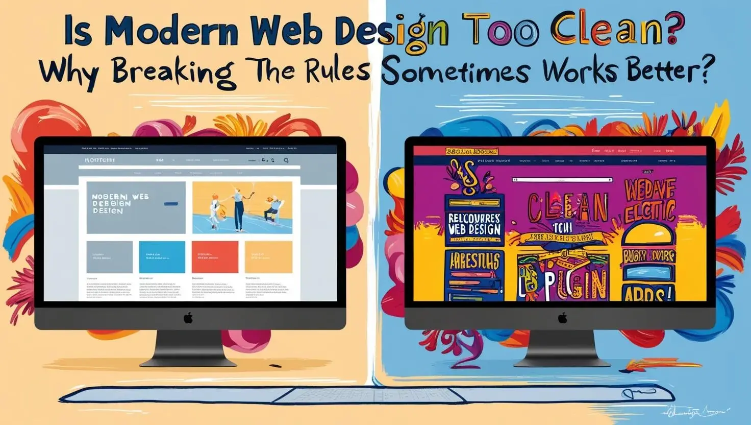
The Rise of Minimalism in Web Design
Over the past decade, the internet has embraced minimalism with open arms. Clean lines, monochrome colour palettes, generous whitespace, and pared-back layouts now dominate digital experiences across industries. Inspired by modernist design principles and driven by the need for faster load times and mobile responsiveness, minimalist web design has become the gold standard. It’s sleek, safe, and universally admired—but has it gone too far?
When every site looks the same, when creativity is constrained by design “rules,” the very thing that makes a brand memorable can get lost. In striving for simplicity, have we sacrificed personality? In this article, we explore why breaking away from overly clean design might actually lead to a better, more engaging user experience.
Clean Doesn’t Always Mean Clear
There’s a common misconception that “clean” design automatically equals clarity. While simplicity can help reduce cognitive load and improve usability, it can also result in ambiguity when taken to the extreme. Overly minimalist interfaces may remove too much context—icons without labels, buttons that look like static images, or navigation menus that are hidden until clicked.
A super-clean aesthetic might feel polished, but if users have to guess where to go next, it defeats the purpose. Design should guide users—not leave them guessing. Sometimes, adding visual cues, texture, or even a bit of controlled chaos can make a site easier to navigate and more emotionally resonant.
Every Site Looks the Same
Minimalism, by nature, follows a specific formula: hero image, centred headline, three-column feature section, footer with contact details. It’s efficient, but it’s also become formulaic. As a result, many websites—especially templates—look strikingly similar.
This homogeneity might be fine for functionality, but it’s a missed opportunity for differentiation. A website should be a reflection of your brand’s unique voice and character. When everyone is following the same design trend, standing out means doing something different—whether it’s embracing unconventional layouts, bold colour choices, or playful animations.
Personality Gets Stripped Away
Modern websites often feel like they’ve been scrubbed clean of personality. Fonts are sans-serif, colours are neutral, imagery is perfectly curated—but where’s the soul? Users remember experiences that evoke emotion, and overly sterile design rarely achieves that.
When brands inject their quirks into their website—through illustration, unexpected copy, or bold creative risks—they become more relatable and memorable. Breaking the clean design mould allows your brand’s humanity to shine through. In a sea of sameness, a touch of personality is your strongest asset.
Function Over Flair Isn’t Always Best
Clean design is often justified by performance. It loads faster, works better on mobile and reduces distractions. But speed and functionality alone aren’t always enough to win over users. People don’t just want efficiency; they crave connection, delight and visual storytelling.
A web experience that feels overly clinical may perform well on paper but fail to inspire any emotional connection. Small moments of surprise, rich visuals or even nostalgic design elements can create meaningful touchpoints that clean minimalism simply doesn’t offer. While clarity is important, design that is too stripped back can leave a website feeling cold or impersonal. In a landscape where every brand is trying to connect, a sterile approach may do more harm than good.
Rule-Breaking Can Boost Engagement
Some of the most memorable digital experiences come from designers who aren’t afraid to bend or even break the rules. Think of experimental sites that challenge scrolling conventions, feature immersive storytelling or use bold typography in unconventional ways. These websites might not be “clean” by traditional standards, but they’re engaging, thought-provoking and deeply memorable.
Of course, breaking rules just to be different can backfire. Poor usability or disorienting interfaces can frustrate users. However, doing so strategically, with clear intent and a deep understanding of your audience, can result in something truly compelling. Rule-breaking in design works best when it serves a purpose—when it enhances storytelling, captures attention or reflects the personality of your brand. It’s about knowing when to push the boundaries and when to respect them.
When to Stick with Clean Design
Despite its limitations, clean design still has a place. It’s particularly effective in industries where trust, simplicity and accessibility are paramount. Banking, healthcare and legal services, for example, often benefit from straightforward design that communicates professionalism and clarity.
Clean layouts are also ideal for content-heavy sites, as they help prevent visual clutter and allow the message to shine. If your goal is to communicate large volumes of information quickly and clearly, minimalism can support that goal. The key is to balance simplicity with soul. Even in clean designs, there should be room for personality—an element that reflects your brand’s essence and creates a memorable user experience.
How to Add Flair Without Losing Function
You don’t need to completely abandon clean design principles to inject creativity into your site. With careful consideration, it’s possible to create a web experience that feels fresh and expressive while remaining functional and accessible. Here are a few ways to add depth, uniqueness and engagement without sacrificing performances:
Use bold typography. Playing with size, weight and placement can help create hierarchy and drama while guiding the user’s eye across the page. Typography can become a powerful visual element that communicates tone and energy.
Reintroduce colour. A strong, unexpected colour palette can dramatically shift the mood of a site. Even a single accent colour can transform a design from ordinary to impactful.
Break the grid. Asymmetrical layouts create a sense of motion and spontaneity, making your site feel more dynamic and alive. They can help you break away from the rigid, predictable structure that often defines template-based designs.
Incorporate microinteractions. Small animations, hover effects or transitions add personality and delight. These subtle touches help users feel more connected to your interface and give them immediate feedback as they interact.
Use authentic imagery. Replacing sterile stock photos with real people and real scenes from your brand humanises your content. Authentic imagery strengthens your brand’s credibility and makes your message more relatable.
Tell stories visually. Integrating illustrations, timelines or scroll-based animations allows you to guide users through a narrative in a visually engaging way. It’s an opportunity to turn passive browsing into an immersive experience.
Conclusion: Clean Isn’t Always King
Minimalist design has its strengths, but it’s not a one-size-fits-all solution. In many cases, overly clean web design has stripped away the uniqueness that helps brands connect with users. In trying so hard to be sleek and modern, websites often end up bland and forgettable.
Don’t be afraid to experiment. Don’t be afraid to colour outside the lines. Clean might be safe, but sometimes, it’s the well-placed disruption—the unexpected twist—that truly captures attention. In a digital world overflowing with sameness, breaking the rules with purpose could be the smartest design move you make.
Contact Digipixel today to build a website that stands out and drives measurable results.