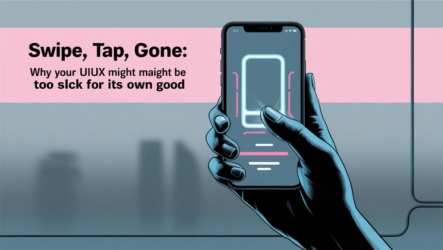
Introduction
We live in a world where speed is king and minimalism reigns supreme. From sleek app interfaces to glossy websites, the modern digital experience is often designed to be fast, intuitive, and aesthetically clean. And while a slick, beautifully crafted UIUX might feel like the pinnacle of good design, it can sometimes be the very thing that pushes users away. Yes, that’s right—your UIUX might be too polished, too fast, and too frictionless for its own good.
In this article, we’ll explore the paradox of ultra-slick user interfaces. We’ll break down the hidden pitfalls of over-optimised design, uncover how “too smooth” can become a usability issue, and discuss what happens when users swipe, tap, and vanish—leaving your website or app behind without a second thought.
When Polished Design Crosses the Line

In the race to deliver modern, sleek, and elegant user experiences, many designers fall into a trap. They pursue minimalism, speed, and aesthetic perfection so intensely that they begin to lose sight of the most essential ingredient in digital design: clarity. What begins as a well-intentioned effort to create a clean interface can gradually become a user experience nightmare. There is a fine line between refined simplicity and frustrating ambiguity. As design trends evolve, an increasing number of websites and apps are becoming overly reliant on ultra-sleek visuals and seamless transitions. While these elements can enhance beauty and create a feeling of sophistication, they can also introduce barriers to usability. Users are left struggling to navigate digital spaces that look elegant but lack direction, context, or even basic instructional cues. Consider the warning signs. When icons are displayed without labels, animations are so fast they become disorienting, and navigation is hidden beneath layers of abstraction, you may have crossed a line. Interactive gestures become unrecognisable or unintuitive. Actions lack any kind of visual feedback. All of this erodes the user experience in subtle but dangerous ways. What began as a clean interface quickly turns into a confusing labyrinth, leaving users unsure of where to click, how to proceed, or even what the platform offers.
Speed Isn’t Always Better: The Problem with Instant Interactions
Speed is one of the most celebrated benchmarks in modern digital experiences. Fast-loading pages, instant redirects, and seamless transitions are often seen as signs of technical excellence. However, speed without intention can create more problems than it solves. Users may find themselves feeling rushed or, worse, disoriented. Instant interactions that occur without user confirmation can feel disempowering. Imagine filling out a form and being redirected to a new page the moment you hit “Enter”—with no message to indicate what just happened. Or picture swiping on a mobile screen and accidentally deleting an item because the gesture was too sensitive and too quick. In these moments, users lose a sense of agency. There is no opportunity to review, to correct, or to change course. A better design approach introduces intentional pauses. Micro-interactions like confirmation pop-ups, success messages, spinners that indicate loading, or subtle animations that show progress provide a sense of orientation. These seemingly small details give users time to process, reflect, and feel more in control. The most effective user experiences are not the fastest but the ones that feel balanced, responsive, and human.
When Minimalism Becomes Meaningless
Minimalism, when executed well, reduces visual clutter and helps users focus. It can enhance performance, aid comprehension, and create a feeling of calm. But minimalism taken too far becomes self-defeating. When a design is stripped of too many elements, it stops being intuitive. Instead, it becomes cryptic. Some common issues arise when minimalism is pushed to the extreme. Designers may use ultra-thin typography that fades into the background or place critical features behind faint icons. They may use “ghost” buttons that are nearly invisible or hide navigation within menus that only appear on hover. Dropdowns may vanish without explanation. Breadcrumbs and progress indicators may be entirely absent. In these cases, the interface is no longer minimal. It is simply lacking. Users should never have to guess how to use a website or app. If a button doesn’t look like a button, if text is unreadable, or if the next step is unclear, then the design is broken—no matter how stylish it appears. True UIUX excellence isn’t about showing the least; it’s about showing just enough to guide users confidently through their journey.
Slick UIUX and Emotional Disconnect
Beyond functionality, there’s another dimension often overlooked in hyper-polished digital environments: emotional connection. A site or app can be perfectly engineered, beautifully styled, and lightning-fast, yet still leave users feeling cold, detached, or indifferent. This is the emotional cost of overly clinical design. When design is reduced to nothing more than smooth transitions and elegant whitespace, it can begin to feel soulless. The platform stops feeling like a brand and starts feeling like a robot. Users don’t just want efficiency; they want to feel understood. They want to engage with content that reflects personality, values, and emotion. To bring back this lost humanity, designers need to infuse their interfaces with storytelling and empathy. This might mean using conversational microcopy, friendly illustrations, and personalised messages that celebrate user achievements. Error messages can be kind and supportive, not robotic. Success screens can express joy. Even small design accents—like animations that feel playful or colours that evoke mood—can bridge the emotional gap. When design feels human, users feel seen. And when users feel seen, they stay longer, engage more, and develop trust.
Understanding Cognitive Load in “Fast” UIUX
Every element of a user interface carries cognitive weight. If users have to pause, decode an icon, backtrack through navigation, or reread a headline just to understand what’s happening, then your interface is increasing cognitive load unnecessarily. Ironically, overly slick designs often do just that. Cognitive load can be raised in several ways: through ambiguous icons that lack labels, through animated transitions that occur too quickly to be processed, or through non-standard gestures that users don’t understand. When users are asked to interpret visual elements without sufficient context, they expend more mental energy than they should. That energy leads to fatigue, frustration, and eventual drop-off. Designers should aim for interfaces that reduce mental effort at every turn. This includes clear iconography, predictable navigation patterns, and minimal decision-making per screen. Break complex tasks into manageable steps. Provide immediate visual feedback. Make the journey feel light and intuitive. When users can move forward without stopping to think at every juncture, they feel more in control—and far more likely to return.
Swipe, Tap… Gone: Analysing the Drop-Off
If your platform is experiencing unusually high bounce rates, low engagement, or frequent drop-offs, the culprit might not be your content. It could be the design. Overly slick UIUX, for all its polish, can be surprisingly exclusionary. Users often leave not because they’re disinterested but because the experience is unclear, uninviting, or just too difficult to engage with. Start by examining the initial interaction points. Does your homepage communicate what your site is about within the first few seconds? Are your navigation elements easily visible and understandable? Are your interactive features labelled clearly or buried under stylised icons? Do users receive confirmation after they complete an action? Are there unexpected gestures that disrupt their flow? Data alone won’t answer these questions. You need to pair analytics with real user testing. Watching users struggle with your interface in real time is often the fastest way to uncover hidden pain points. Often, the problem isn’t the product or the message—it’s that users simply don’t know what to do next.
Conclusion: Designing with Empathy Over Ego
In the pursuit of flawless design, many teams forget who they’re building for. The most impactful digital experiences are not the ones that impress users with style but the ones that empower users through understanding. Design should never be an exercise in ego. It should be a practice rooted in empathy. Polish, performance, and beauty are all desirable traits. But they must never come at the cost of usability, clarity, or connection. Slick interfaces might win design awards, but they often lose users. In contrast, interfaces that feel human, helpful, and honest tend to build loyalty and long-term success. So before you finalise your next redesign, take a step back. Ask yourself not whether it looks cutting-edge but whether it makes sense, feels human, and serves real needs. Because when you prioritise empathy over ego, clarity over cleverness, and function alongside form, your design doesn’t just look good—it works beautifully. And that’s the kind of experience users will remember.
Contact Digipixel today to build a website that stands out and drives measurable results.