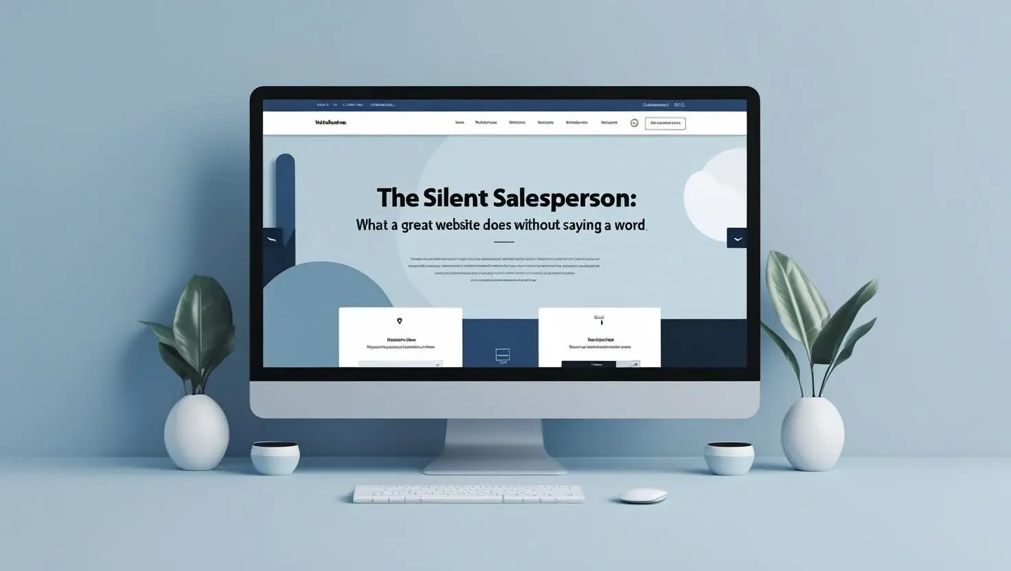
First Impressions Speak Loudly Without Words
Before a visitor reads a single headline, your website has already spoken. Its layout, colour palette, and structure form an instant message about your brand’s credibility and personality.
This unspoken communication shapes trust, curiosity, and attention. Users decide in seconds whether to stay or go.
Your site’s silence is louder than you think.
Layout Tells the Story First
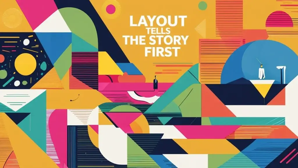
The way a site is organised guides users through an invisible path. A clean, logical layout feels like a helpful salesperson gently showing the way.
If the structure is confusing, visitors feel lost and frustrated. Without words, your site says, “We care” or “We are careless.”
Order is silent persuasion.
Colour Creates Emotional Response
Colours speak emotional language fluently. Blue brings calm and trust. Red sparks urgency. Green suggests freshness or growth.
A muted palette soothes, while bright contrasts energise. Users feel these messages before they read a line of text.
Your colours quietly set the mood.
Visual Hierarchy Directs the Eye
Great design leads the visitor’s gaze from point to point, like a guide holding a lantern. Larger elements grab attention first. Bold buttons suggest action.
Subtle changes in size, contrast, or position say what matters most. The user reads without realising they are reading.
This is the voice of design.
White Space Offers Breathing Room
Crowded pages overwhelm the mind. Generous white space makes content feel calm, clear, and important.
It gives every element space to shine, like pauses in a conversation. Visitors feel relaxed, not rushed.
A quiet design encourages patient exploration.
Imagery Sets the Brand Tone
Photos and illustrations speak volumes before any caption explains them. Smiling faces, natural settings, or polished product shots tell silent stories.
Stock photos can feel fake and break trust. Real, thoughtful images build warmth and honesty.
Pictures sell without speaking.
Microinteractions Whisper Delight
Tiny hover effects, gentle animations, and soft button feedback make the site feel alive. These microinteractions suggest care, quality, and personality.
They make the user feel noticed. A little bounce or glow says, “We thought of you.”
Subtle motion connects emotionally.
Consistency Builds Trust Quietly
A unified style across pages feels safe and reliable. Inconsistent design confuses and distracts.
Fonts, colours, icons, and layouts must harmonise. This quiet consistency tells users the brand is thoughtful and professional.
Trust grows in this silent stability.
Speed Shows Respect Without Words
A fast-loading site feels modern and respectful of the visitor’s time. Delays or lag whisper carelessness or outdated systems.
Without saying a word, speed builds confidence. It tells users their needs matter.
Patience is short online. Speed speaks volumes.
Navigation Hints Without Explaining
Well-designed menus and buttons guide users smoothly. They feel where to click without hesitation.
Clear icons, logical paths, and simple labels create effortless journeys. Visitors find what they want easily.
Good navigation sells without hard selling.
Forms That Feel Effortless
A contact or checkout form designed well feels short and simple, even when it collects lots of data.
Clear fields, gentle prompts, and reassuring progress markers keep the process smooth. No frustration builds.
The site whispers, “This will be easy.”
Content Structure Enhances Flow
Headings, bullet lists, and short paragraphs shape information for quick reading. Skimming visitors still absorb key messages.
This structure respects attention spans. It guides without force, helping users find answers fast.
The design says, “Here’s what you need.”
Subtle Calls to Action Convert Gently
A well-placed button or link can guide decisions without loud commands. Soft colours, thoughtful wording, and simple placement do the work.
“Learn More” feels inviting. “Get Started” sounds helpful.
Visitors choose willingly, not under pressure.
Trust Elements Reassure Silently
Badges, certifications, and testimonials placed wisely build trust instantly. Users feel safe without reading the fine print.
These visual cues whisper, “You can rely on us.” Confidence rises without long explanations.
Silent trust wins conversion.
The Psychology of Quiet Persuasion
Humans notice what feels natural. When a site gently guides and reassures, users lean in, stay longer, and explore deeper.
Overly loud design triggers caution or fatigue. Quiet design builds comfort.
Calm persuasion wins where noise fails.
The Mistakes of Loud Websites
Pop-ups, auto-play videos, flashing banners, and shouting headlines overwhelm visitors. They break trust and trigger exits.
Too much noise kills the silent sale. Users flee before discovering value.
Less noise means more attention.
Testing the Silent Approach
Analytics reveal if the quiet strategy works. Low bounce rates, long session times, and high conversion rates signal success.
User feedback confirms ease and comfort. Design whispers are heard in these numbers.
Listening sharpens future improvements.
Conclusion: Let the Design Speak Softly
A great website sells without shouting. It greets visitors warmly, guides their steps gently, and earns trust silently.
Every visual choice, space, and interaction builds a quiet conversation. Users feel valued, safe, and understood.
In digital spaces crowded with noise, silence sells best.
Contact Digipixel today to build a website that stands out and drives measurable results.