
Introduction
In today’s fast-paced and technology-driven digital landscape, where mobile devices are the primary means of accessing the internet for a large portion of the global population, having a responsive web design is no longer a choice—it is a fundamental necessity for businesses across industries. The way we interact with the web has fundamentally shifted from desktop-only usage to a world where users are engaging with websites on smartphones, tablets, laptops, and other devices with varying screen sizes. Whether browsing social media, making online purchases, or researching products and services, people expect websites to function seamlessly and efficiently across all these devices.
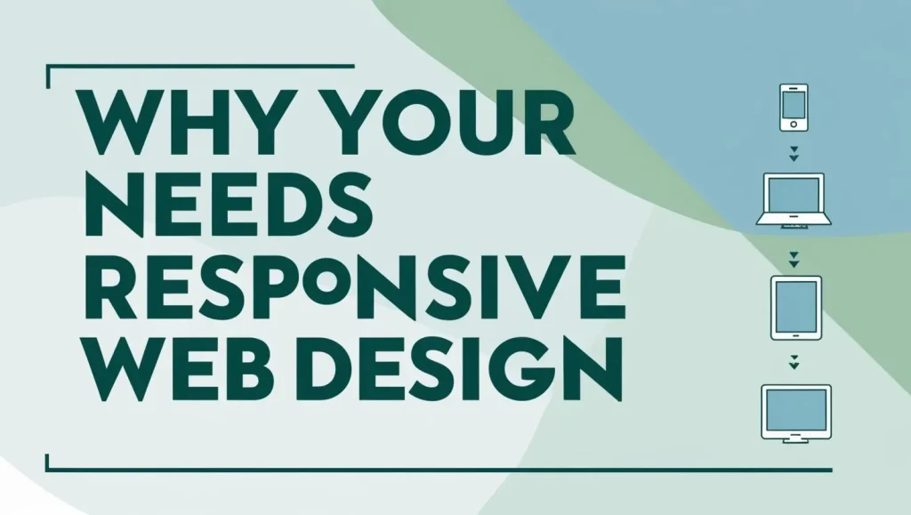
This shifting trend has led to an increasing emphasis on responsive web design—an approach to website creation that ensures a website’s layout and functionality adapt smoothly to any device. In this comprehensive guide, we will explore the top 10 reasons why responsive web design is essential for businesses, large and small, and how it can contribute to greater user satisfaction, improved business outcomes, and future-proofing your online presence.
Why You Need Responsive Web Design
1. Mobile Usage is Skyrocketing:
In the past decade, there has been a monumental shift in how consumers access the internet. The prevalence of mobile devices has surged, transforming the digital landscape. As of recent studies, mobile internet usage has consistently outpaced desktop usage, with mobile traffic now accounting for over 55% of global web traffic. This trend has become particularly prominent in regions with high smartphone penetration, such as Asia, where mobile phones are often the primary, if not the only, device used to access the internet. The shift is not limited to just personal browsing—people are using their mobile devices for everything from social media interaction and online shopping to researching products, checking emails, and even navigating through cities with map applications.
This dramatic rise in mobile usage underscores a key fact: businesses can no longer afford to ignore the increasing number of users who rely exclusively on mobile devices for internet access. Mobile devices, particularly smartphones and tablets, have become the go-to platform for browsing and engaging with online content. If your website isn’t optimised to cater to this growing mobile user base, you are essentially missing out on a significant portion of potential customers, prospects, and clients. As more people turn to their smartphones for web browsing, it’s essential for businesses to ensure that their website is accessible, functional, and optimised for these smaller, touch-based devices.
The rise of mobile usage doesn’t just signal a shift in user behaviour—it also signifies a fundamental change in how people perceive and interact with the digital world. As mobile devices become the dominant platform for browsing, consumers are developing new expectations. They expect websites to load quickly, display properly, and provide a seamless experience, no matter what device they’re using. With responsive web design, your website can automatically adjust its layout to suit various screen sizes, providing a better user experience regardless of whether the user is on a small smartphone or a larger tablet. This ensures that your website remains visible, accessible, and functional for all users, regardless of the device they’re using. As a result, businesses that invest in responsive web design are better positioned to capture the attention and loyalty of a growing mobile-first audience.
2. Enhanced User Experience:
One of the most compelling reasons to adopt responsive web design is its ability to significantly enhance the user experience (UX). In an era where convenience and speed are paramount, consumers expect websites to be easy to navigate, visually appealing, and fully functional, regardless of the device they use. Responsive web design ensures that your website adapts fluidly to different screen sizes, orientations, and resolutions. Whether a user is browsing on a smartphone, tablet, or desktop computer, they will enjoy a consistent, intuitive, and optimised browsing experience.
Before the widespread adoption of responsive design, many websites were designed with a desktop-first mentality, which resulted in a poor user experience for mobile users. On these non-responsive sites, mobile users often had to zoom in to read text, scroll horizontally to view content, and deal with misaligned images and broken layouts. These issues were frustrating and discouraged users from engaging with the website, leading to higher bounce rates and decreased satisfaction.
Responsive design eliminates these problems by ensuring that content is appropriately sized and organised for each device. This means users no longer have to struggle with resising images, zooming in on text, or navigating awkward layouts. Whether they are using a small-screen mobile device or a large desktop monitor, users will encounter a site that is easy to read, navigate, and interact with. This improved accessibility and ease of use can significantly enhance user satisfaction, making visitors more likely to stay on your site, engage with your content, and return in the future.
In addition to improving usability, responsive design can also help reduce friction in the user journey. With a responsive website, visitors won’t have to adjust their behavior based on their device. The experience will be intuitive and consistent, which ultimately leads to higher levels of engagement, lower bounce rates, and a stronger connection between the user and the brand. The result is a more enjoyable browsing experience that enhances your chances of retaining visitors, building brand loyalty, and increasing conversions.
3. Improved SEO Performance:
Responsive web design doesn’t just improve user experience—it also plays a vital role in improving search engine optimisation (SEO). Google, the world’s most popular search engine, has increasingly emphasised the importance of mobile-friendliness in determining search rankings. In 2015, Google announced that mobile-friendliness would be a ranking factor in its search algorithm, and in 2018, Google switched to mobile-first indexing. This means that Google primarily uses the mobile version of a website’s content for indexing and ranking, regardless of whether the user is on a mobile device or a desktop computer.
The significance of mobile-first indexing cannot be overstated. If your website isn’t optimised for mobile devices, you risk being penalised in search rankings, making it harder for potential customers to find your site. On the other hand, a responsive website—one that adapts to both mobile and desktop devices—ensures that your content is properly indexed and ranked by search engines. This provides a significant SEO advantage, as your website will be more likely to appear in search engine results for both mobile and desktop users.
In addition to boosting SEO performance through mobile-friendliness, responsive web design helps consolidate your SEO efforts. With a responsive website, you only need to maintain one version of your site, which simplifies your SEO strategy. If you have separate versions of your site for desktop and mobile users (such as a mobile site and a desktop site), there’s a risk of duplicate content, which can harm your SEO rankings. Responsive design, however, eliminates this issue by providing a single, unified version of your site that works across all devices, helping you avoid the complications of managing multiple URLs and duplicate content.
Furthermore, responsive design improves other important SEO factors, such as page load speed. Google’s ranking algorithm also takes page speed into account, and responsive web design helps optimise load times by automatically adjusting images and content based on the device’s screen size and capabilities. As a result, responsive websites tend to load faster, improving user experience and contributing to higher search engine rankings.
4. Cost-Effectiveness:
Maintaining a separate desktop and mobile version of your website can be both time-consuming and expensive. Developing two versions of a website requires additional resources, both in terms of design and development, as well as ongoing maintenance. Each version of the site needs to be updated independently, and any changes, whether related to content, design, or functionality, must be made twice. This not only leads to higher operational costs but also increases the potential for errors, inconsistencies, and confusion.
Responsive web design, on the other hand, offers a cost-effective solution by eliminating the need to maintain two separate versions of a website. Instead of developing and updating a desktop site and a mobile site independently, a responsive website consolidates both into a single, unified version that adapts to different screen sizes. This reduces the complexity of website management and minimises the resources required for maintenance, allowing businesses to allocate their budgets more efficiently.
Moreover, with a responsive website, any updates—whether related to content, design, or features—need to be implemented only once. This simplifies the process and reduces the risk of discrepancies between the desktop and mobile versions of the site. As a result, businesses save both time and money while ensuring a consistent and high-quality experience for all users, regardless of the device they are using.
Additionally, because responsive websites are designed to be flexible and adaptable, they are easier to scale and adjust as your business grows. Whether you’re launching new products, expanding into new markets, or updating your branding, responsive design ensures that your website can evolve alongside your business without requiring a complete redesign or costly overhaul.
In conclusion, responsive web design offers numerous benefits that go beyond simply making your website mobile-friendly. It improves user experience, enhances SEO performance, and provides cost-effective solutions for web development and maintenance. By embracing responsive design, businesses can ensure that their website remains accessible, efficient, and competitive in an increasingly mobile-first digital world.
5. Faster Page Loading Speeds:
Page load time is one of the most critical factors when it comes to user experience on the internet. Research consistently shows that the speed at which a webpage loads directly impacts the way users interact with that page. Slow websites are a significant turn-off for users, especially in today’s fast-paced digital world, where patience is minimal and time is precious. Studies reveal that 53% of mobile users will abandon a website if it takes longer than three seconds to load. For businesses, this means that slow-loading websites can lead to an increased bounce rate, lower user engagement, and diminished conversion rates, which can severely hinder overall business performance and growth.
Responsive web design is particularly beneficial in optimising page loading speeds across different devices and platforms. One of the main ways responsive design achieves this is by ensuring that all website elements, such as images, videos, and scripts, are appropriately sized and formatted for each device type. For example, on mobile devices, smaller image sizes are used to ensure that they load more quickly, while still maintaining their visual appeal. Similarly, unnecessary content that is not essential for the mobile experience can be minimised or removed entirely, further improving load times. In addition to this, responsive websites often reduce the reliance on external elements, such as third-party scripts or widgets, which can further slow down loading times. By focusing on delivering a leaner, more efficient website experience, responsive design optimises load times, ensuring that the website remains fast and functional for users across a variety of devices.
Faster page load times do more than just improve user satisfaction—they also play a key role in improving a website’s search engine ranking. Google has been transparent about its focus on page speed as a ranking factor, meaning that faster websites are more likely to rank higher in search results. This is particularly important given the rise of mobile-first indexing, where Google predominantly uses the mobile version of a website to rank it in search results. As a result, businesses that embrace responsive web design, which is optimised for speed across all devices, not only provide a better user experience but also enhance their search engine optimisation (SEO) efforts, leading to increased visibility and more organic traffic. Ultimately, responsive web design provides a double benefit: a faster, more user-friendly website and improved SEO performance.
6. Increased Conversion Rates:
Conversion rates refer to the percentage of website visitors who take a desired action, such as making a purchase, filling out a contact form, or subscribing to a newsletter. In today’s competitive digital landscape, converting visitors into customers or leads is crucial for business success. A responsive, mobile-optimised website plays a fundamental role in improving conversion rates. If your website isn’t optimised for mobile devices, potential customers may encounter difficulties interacting with your site, leading to frustration and ultimately abandoning their journey before completing a desired action.
Responsive web design ensures that users, regardless of the device they are using, have a seamless and enjoyable browsing experience. Whether someone is visiting your site on a smartphone, tablet, or desktop computer, responsive design guarantees that the website is easy to navigate, visually appealing, and fully functional. With a mobile-friendly, user-centric layout, users are more likely to stay engaged with the site, browse more pages, and explore additional products or services. A responsive website streamlines the navigation process, making it easier for users to find what they’re looking for, whether that’s making a purchase, signing up for a service, or submitting their contact information. By reducing barriers to interaction and providing a smoother, more enjoyable user journey, responsive web design ultimately increases the likelihood that visitors will convert into customers or leads.
Additionally, responsive design ensures that the entire conversion process—from browsing to checkout or form submission—is optimised for mobile devices. This is particularly important as more and more users complete purchases on smartphones and tablets. Without a mobile-optimised site, users may struggle with filling out forms, adding items to their cart, or completing checkout processes, leading to abandoned shopping carts and missed sales opportunities. With a responsive design, however, all steps of the conversion process are adapted for mobile users, which increases the chances of completing a transaction or desired action. As a result, responsive design is a critical factor in improving conversion rates, driving business growth, and enhancing customer satisfaction.
7. Future-Proofing Your Website:
As technology continues to evolve at an unprecedented pace, new devices and technologies are constantly emerging. These innovations bring with them new screen sizes, resolutions, input methods, and even entirely new ways to interact with the digital world. Smartwatches, augmented reality (AR) devices, voice-activated assistants, and even foldable smartphones are examples of technologies that are reshaping the digital landscape. As a business, staying ahead of these changes and ensuring that your website remains compatible with new devices is essential. This is where responsive web design truly shines, providing businesses with the flexibility and adaptability needed to future-proof their online presence.
Responsive web design is inherently adaptable, meaning it can accommodate new devices and technologies without requiring a complete overhaul of your website. With responsive design, your website automatically adjusts to fit different screen sizes and resolutions, ensuring that it remains accessible and functional, no matter what device users are using. Whether it’s a new type of smartphone, a smartwatch with a smaller display, or even a next-generation AR headset, a responsive design ensures that your website remains optimised for each new platform. This forward-thinking approach allows businesses to continue providing a seamless user experience across a wide range of devices, no matter how technology evolves.
The importance of future-proofing your website cannot be overstated, especially as new digital experiences and technologies become more integrated into our daily lives. By embracing responsive web design, businesses position themselves to remain competitive and stay ahead of the curve. As the digital landscape continues to change, businesses that have invested in responsive design will be able to adapt quickly and continue delivering high-quality user experiences, regardless of how technology evolves. This forward compatibility ensures that your website will remain relevant and functional, giving your business a significant advantage as new technologies reshape the way users interact with digital content.
8. Reach a Wider Audience:
In today’s globalised digital world, businesses have an unprecedented opportunity to reach a wide variety of audiences, from local customers to international markets. However, in order to take full advantage of this potential, it’s crucial to ensure that your website is accessible and user-friendly across all devices. With the proliferation of mobile devices, a significant portion of online traffic now comes from smartphones and tablets. Therefore, businesses must ensure that their websites are optimised for mobile users in addition to desktop visitors. This is precisely what responsive web design allows businesses to achieve.
With a responsive website, businesses can ensure that their content is accessible and easy to navigate, no matter what device users are on. Whether visitors are using a high-end smartphone, a budget-friendly tablet, a laptop, or a traditional desktop computer, responsive design ensures that your website adapts to provide an optimal user experience on all screen sizes. This broadens your market reach by making your website accessible to a wider range of users, regardless of the devices they own. For businesses, this means tapping into new audiences and expanding the customer base. The more devices your website supports, the more likely you are to attract and engage visitors from diverse demographics, leading to increased traffic, higher engagement, and ultimately more conversions.
Moreover, responsive web design can also help businesses optimise their website for various geographical regions, as it ensures that users from different parts of the world can access and navigate the site without issues. This is especially important for businesses with a global audience, as cultural and regional differences may affect how users interact with websites. Responsive design allows businesses to adapt to these differences while still providing a consistent and high-quality user experience across all devices and platforms.
9. Competitive Advantage:
In the competitive world of business, having a strong online presence is crucial for success. With more companies competing for the attention of online users, businesses that fail to provide an optimal user experience risk falling behind their competitors. As consumer expectations rise, customers increasingly demand websites that are easy to use, mobile-friendly, and fast-loading. A responsive website can give your business a significant edge in this competitive environment, helping you stand out from the crowd and capture the attention of your target audience.
Investing in responsive web design demonstrates to your customers that you are committed to providing a seamless, high-quality online experience. It shows that you understand the importance of accessibility, usability, and user satisfaction, and that you are willing to invest in technology that makes it easier for users to interact with your brand. A responsive website can also help build trust with your audience, as users are more likely to engage with businesses that offer a user-friendly, mobile-optimised browsing experience. Furthermore, responsive web design positions you as a forward-thinking company that stays ahead of the curve in terms of technology and user expectations. By offering a responsive website, you demonstrate that you are serious about meeting customer needs and staying competitive in a rapidly changing digital landscape.
10. Adaptability and Flexibility:
Responsive web design offers unparallelled adaptability and flexibility, making it an ideal choice for businesses that are constantly evolving and growing. As your business changes, whether by launching new products, expanding into new markets, or updating your branding, your website will need to reflect these changes. A responsive website makes this process much easier, as it ensures that all updates and changes can be implemented seamlessly across all devices.
With responsive design, businesses can update their website without worrying about how the changes will affect the layout or functionality on different devices. Whether you’re redesigning your site, adding new content, or making changes to your product offerings, responsive design ensures that the changes will be automatically adapted to fit various screen sizes and resolutions. This flexibility allows businesses to stay agile and make updates quickly, without the need for a complete site overhaul or extensive redevelopment. As your business grows, responsive design ensures that your website can scale and evolve alongside your needs, providing a smooth and consistent experience for users across all devices.
In conclusion, responsive web design offers numerous advantages, from faster page load speeds and increased conversion rates to future-proofing your website and reaching a wider audience. By investing in responsive design, businesses can improve user experience, enhance SEO performance, stay competitive, and ensure that their website remains functional and accessible across a variety of devices and platforms. Ultimately, responsive web design provides businesses with the tools they need to succeed in an increasingly mobile-first digital world, helping them stay ahead of the competition and continue to thrive in a rapidly changing market.
Conclusion
In conclusion, responsive web design is not just a trend or a passing fad—it is an essential component of any successful business strategy in today’s digital landscape. From improving user experience and SEO performance to increasing conversion rates and future-proofing your website, the benefits of responsive design are undeniable. As mobile internet usage continues to grow and new devices emerge, businesses must prioritise responsive design to ensure that they remain accessible, competitive, and relevant in the ever-changing digital world.
Investing in a responsive website is a long-term solution that provides a consistent, user-friendly experience across all devices and platforms. By embracing responsive web design, businesses can enhance their online presence, build stronger customer relationships, and drive sustained growth in the digital age.
Contact Digipixel today to build a website that stands out and drives measurable results.