IAs mobile usage continues to dominate digital behaviour in Singapore, the way your website adapts to different screen sizes has never been critical. For businesses investing in web development in Singapore, the debate often come down to two approaches: responsive web design or adaptive web design.
Both aim to provide a seamless user experience across devices, but they do so in very different ways. So, which one works better for the fast-paced and mobile-first Singapore market?
What is Responsive Web Design and How Does It Work?
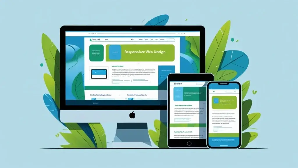
Responsive web design is a fluid approach where a single website layout adjusts automatically to any screen size, whether desktop, tablet or mobile. It relies on flexible grids and media queries to rearrange content based on the user’s device.
This method is widely used in modern website development in Singapore because it simplifies maintenance and ensures consistency. Since there’s only one codebase, changes apply across all screen sizes.
For SMEs aiming for efficiency and scalability, responsive design is often the go-to-strategy, especially when combined with strong website support and content updates.
What is Adaptive Web Design and How Is It Different?
Adaptive web design, in contrast, uses multiple fixed layouts built for specific screen widths like one for mobile , one for tablet, and one for desktop. When a user visits the site, the server detects the device and loads the most suitable version.
This can provide more control over the user experience on each device type. However, it requires more design and development effort since multiple layouts must be created and maintained.
In some cases, adaptive design offers faster load times on mobile because it’s highly optimised. But it may also result in higher development costs and more complex web management in Singapore.
Responsive Web Design for Singapore’s Mobile-First Users
Singapore’s internet users are highly mobile over 92% access the web through smartphones daily. That makes responsive web design a practical and scalable solution for most brands operating locally.
Responsive layouts ensure a consistent experience, whether someone is browsing on an iPhone on the MRT or working from a desktop at the office. It’s also better for SEO, as Google recommends responsive design for mobile indexing.
For businesses applying for PSG Grant support for website upgrades, responsive design is often a requirement in the project scope due to its future-proof nature.
When Adaptive Web Design Might Be the Better Choice
While responsive design suits most SMEs, certain businesses may benefit more from adaptive web design. This includes brands with complex interactions, such as eLearning platforms or mobile apps that require highly customised mobile layouts.
Adaptive design may also appeal to companies that want more control over content placement or performance across varying screen sizes. However, the need for ongoing website support is greater due to the multiple versions in use.
it’s essential to weigh the long-term costs, especially in Singapore’s competitive digital space where time-to-market and agility matter.
How to Choose the Right Web Design Approach in Singapore

Choosing between responsive and adaptive web design depends on your audience, business needs, and technical capabilities. Responsive design is typically more cost-effective and scalable, while adaptive design offers tailored experiences but with added complexity.
For most Singapore businesses, responsive design provides the right balance of flexibility, speed, and ease of maintenance. It’s also ideal for SMEs that need to keep their websites updated regularly without managing multiple layouts.
Working with an experienced web developer in Singapore can help you make the right call based on data, not assumptions.
Future-Proofing Your Website Design for Singapore Users
Whether you’re building a brand-new website or revamping an existing one, user experience should be at the core of your decision. Responsive design continues to be the industry standard but adaptive design still has its place in niche use cases.
In a digitally driven economy like Singapore’s , first impressions count. And with users expecting flawless browsing across all devices, investing in the right design strategy is more crucial than ever.
If your website doesn’t meet user expectations, you may be losing valuable leads before they even scroll past the first fold.
Not Sure Which Design Works for You? Let’s Talk.
Choosing between responsive and adaptive web design shouldn’t be guesswork. At DIGIPIXEL, we offer strategic consultation, modern web development, and full website support to help you build with purpose.
Contact DIGIPIXEL to schedule a consultation.
Click here to view our portfolio and explore our past projects
Click here for your estimated quote based on your business needs
Let’s create a website that adapts and performs wherever your users are.